Laurel Ag + Water
SERVICES
BRAND STRATEGY
NAMING
BRAND IDENTITY + LOGO SYSTEM
COLLATERAL
PRESS RELEASE COPYWRITING
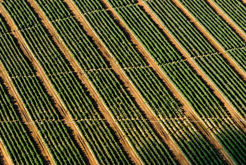
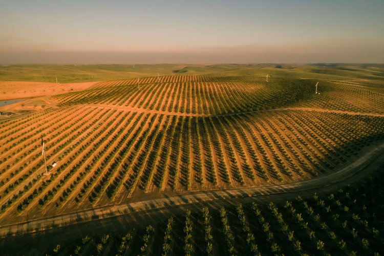
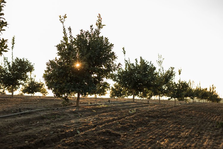
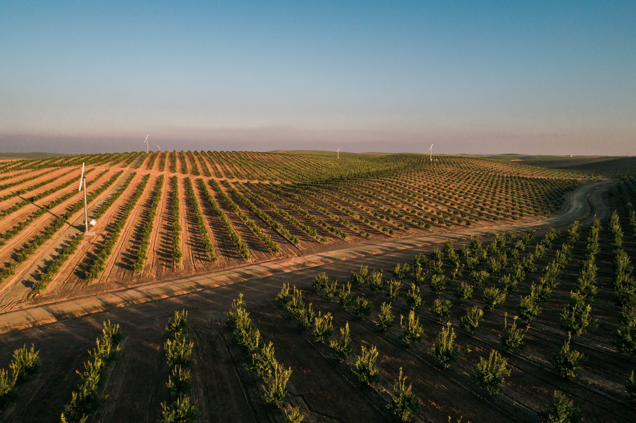
Premier Agriculture + Water Solutions
When Laurel Ag first approached Purveyor Branding Co., they were looking to define their brand, name, look and feel with a new, comprehensive brand identity. Laurel is the culmination of Arable Capital Partners’ acquisition of several like-minded businesses located in the Central Valley of California, and they knew it was vital to create a new, cohesive identity to bring their efforts together.
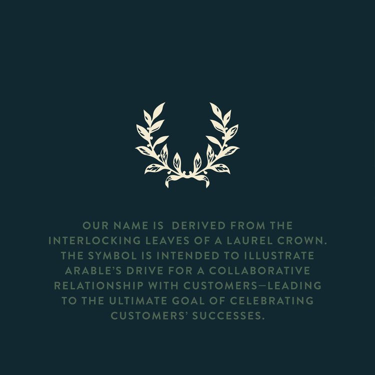
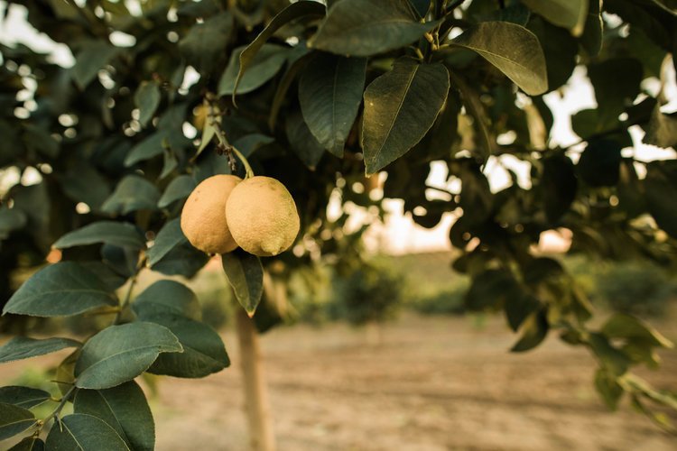
Because success, heritage and collaboration were key elements, we chose laurel as both name and symbol. To help bring the laurel wreath idea home, we developed an aesthetic, color story and identity system using greens with blue undertones to illustrate the services provided — water and agriculture solutions.
Laurel’s transformation is huge. The acquisition is now formalized through a new identity — one that each of the individual businesses feels connected with and can own as they hand out their new business cards.