
Rancho Tree Service
Rancho Tree Service came to us at an inflection point. The company was scaling quickly, expanding its workforce, and looking to evolve its role within the utility vegetation management space across California and beyond. They had momentum, strong relationships with major utilities, and a clear sense of where they wanted to go next. What they needed was a way to articulate that evolution.
From our side, the opportunity was immediate, but not straightforward. Utility vegetation management wasn’t a category we knew deeply. To do the work properly, we had to build that understanding from the ground up. That meant learning how the industry operates, who the major players are, where Rancho fits, and why the work matters at a systems level. What became clear early on is that this isn’t peripheral work, rather it was foundational because the reliability of entire regions depends on it.
Rancho tree service Brand Scope:— Strategy
— Messaging
— Visual Identity Design
— Website Design
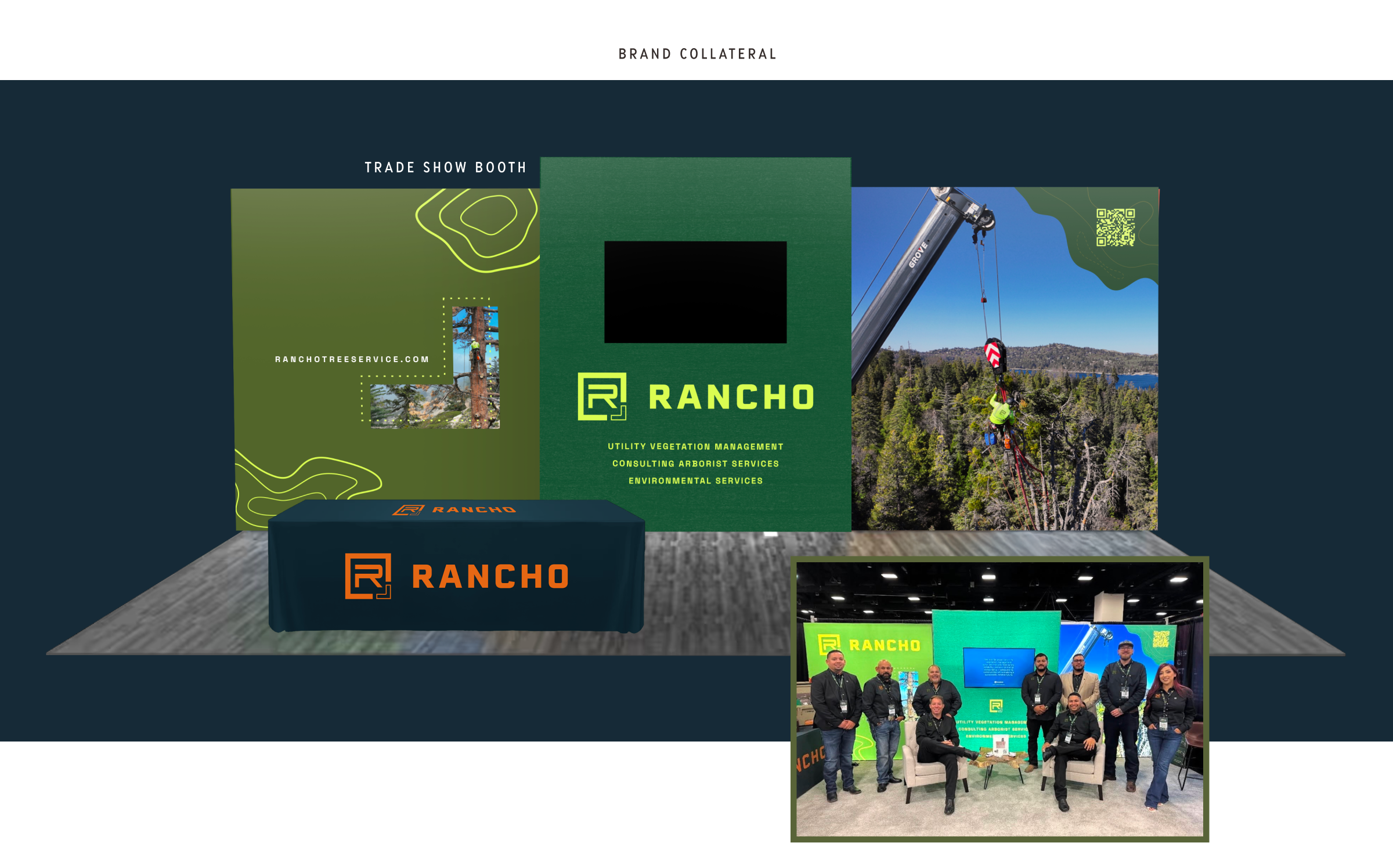
— Tradeshow Booth Design
— Brand Guidelines
What stood out just as quickly was Rancho itself. They weren’t trying to become something they weren’t. They had already built a respected operation through experience, grit, and a deep understanding of the field. The story behind the company carried real-world weight: A Mexican-American, family-founded business that grew into a trusted partner for utilities like SCE, SDGE, and PG&E, without losing its sense of responsibility to the people doing the work.
They knew their capabilities. They knew their ambition. What they lacked was structure around how to express it and how to prepare on a brand level for their impending scale.
There was a clear brand gap. The company had outgrown how it was being perceived. Internally, they talked about this as moving from Rancho 1.0 to Rancho 2.0, with Rancho 3.0 representing the version of the company they were actively building toward. A more mature, more visible, more fully realized operator in the market.
That’s where our role became defined, because we were there to understand the story, organize it, and build a system around it that could scale with the business. That meant translating technical expertise into clear messaging, aligning internal and external perception, and helping Rancho step into the next phase of its growth with intention.
About Rancho Tree Service
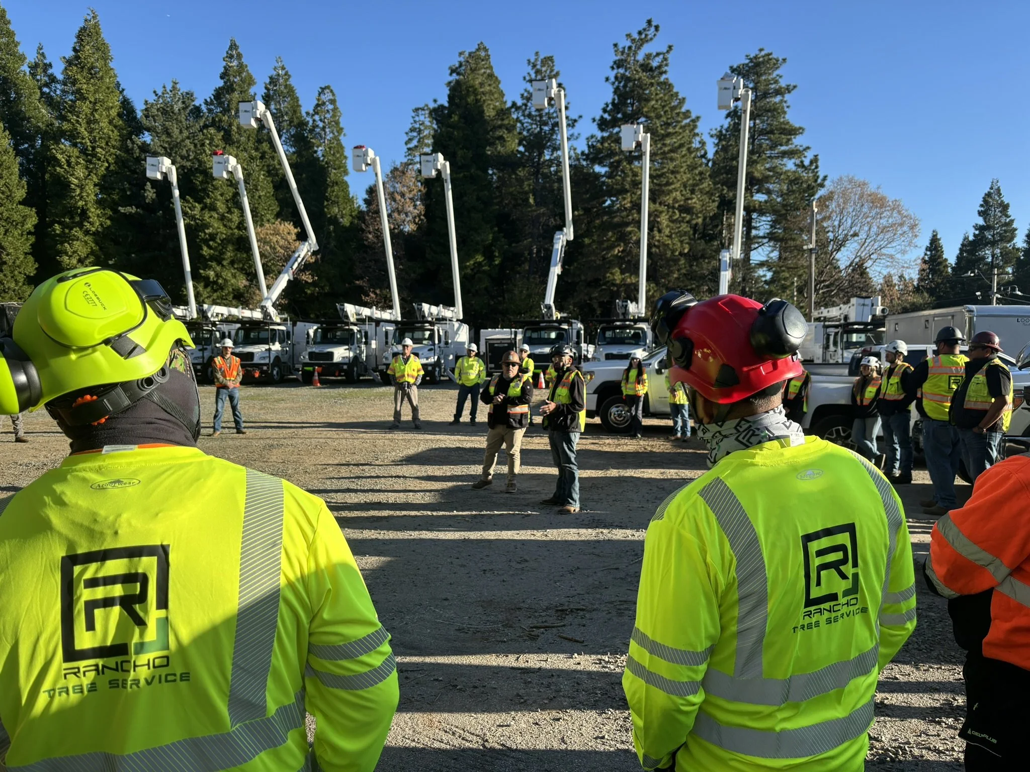
Rancho Tree Service is a California-based utility contractor specializing in vegetation management, emergency response, environmental services, and geospatial solutions. Founded in 2010 by José and Griselda De La Cruz, the company has grown from a small, family-run operation into a multi-state partner serving major utilities across the western United States.
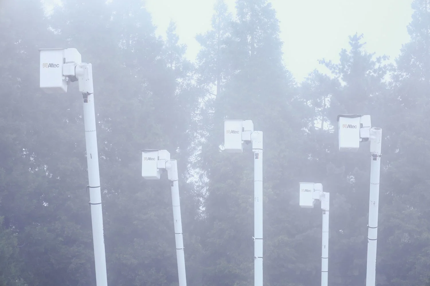
While the scale has changed, the foundation has not. Rancho is still led with the same work ethic and accountability it was built on, now applied to complex, high-liability infrastructure work that requires precision, speed, safety, and consistency. The company operates at the intersection of field execution and forward-looking technology, investing in tools like LiDAR and advanced mapping to prevent disruptions before they occur.
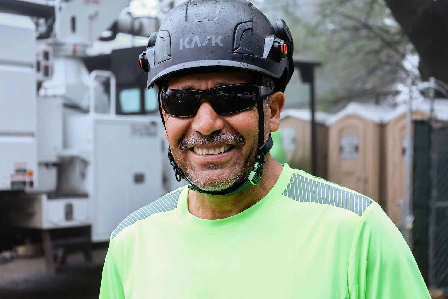
Rancho’s impact on the community is both direct and often unseen. Their work helps reduce wildfire risk, maintain reliable power, and ensure faster recovery during storms and natural disasters. In parallel, the company invests in its workforce and the regions it operates in, creating jobs, developing talent, and maintaining a people-first culture rooted in safety, growth, and long-term opportunity.
At its core, Rancho supports the systems communities rely on every day, whether or not those systems are visible.
Strategy + Messaging
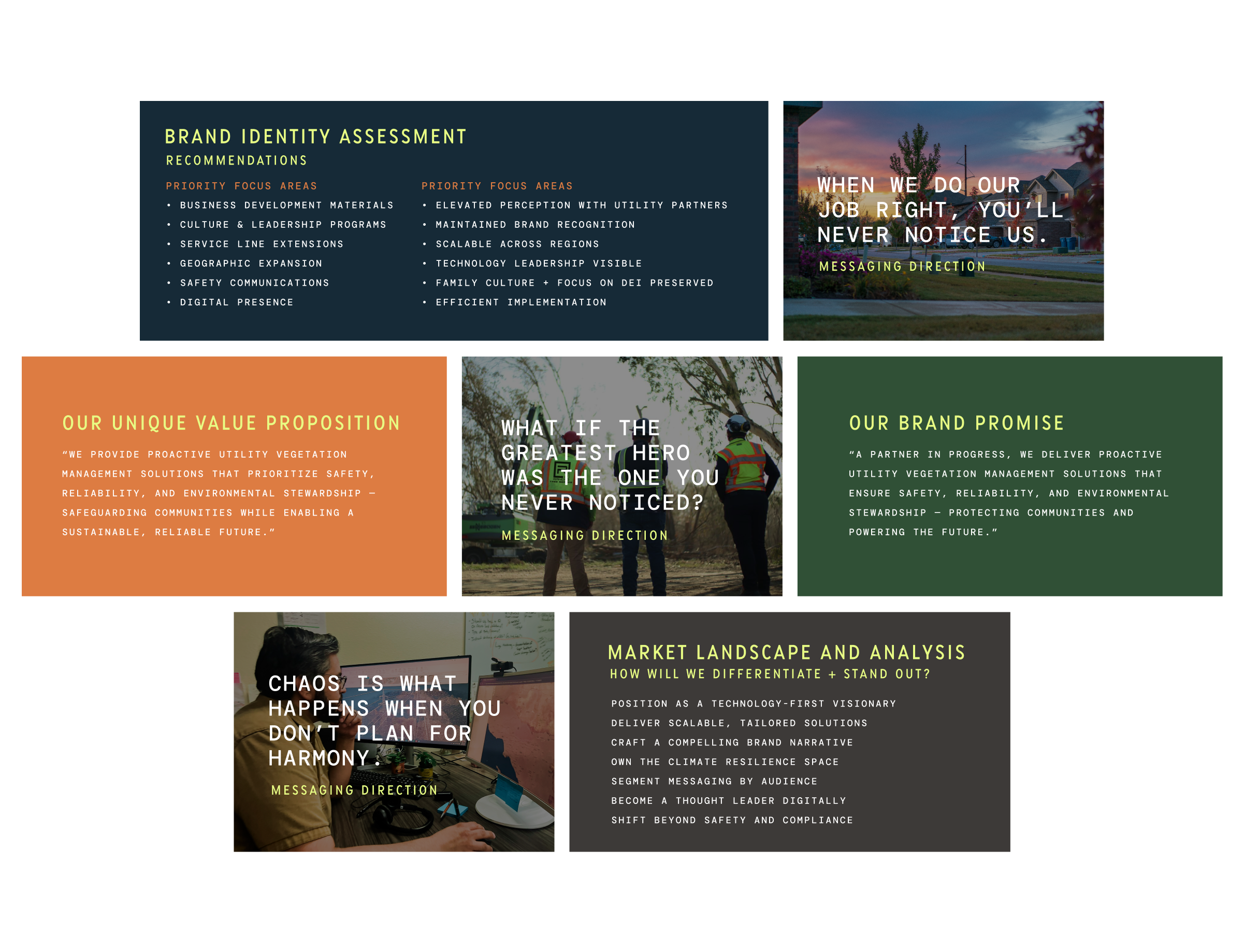
The ultimate goal was to close the gap between what Rancho actually is and how it was being perceived.
They had already evolved into a sophisticated, multi-service utility contractor, but the brand still read as a regional tree service. That disconnect limited how they showed up with utility partners, how they were evaluated in the market, and how confidently they could step into larger opportunities. The work was to bring clarity and structure to what was already true, and build a platform that could support where they were going next.
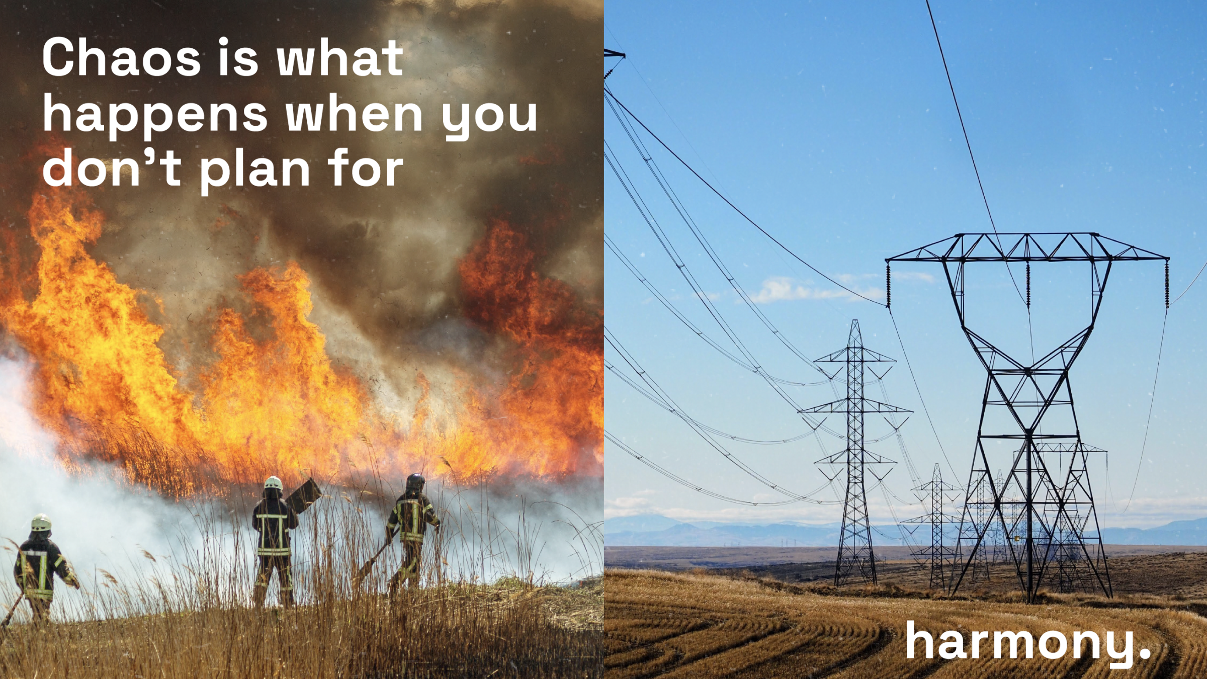
A lesson in preventionThe messaging approach started with a shift in perspective. Most companies in this category focus on action. Storm response. Emergency work. Crews in high-intensity situations. Rancho did that work, but it wasn’t the full story. What became clear through discovery is that their real value sits in prevention. The work that happens before anything goes wrong. The planning, the inspection, the clearing, the coordination that keeps systems running without interruption. That was our foundation.
We developed a messaging platform that reframed their role, positioning Rancho not as a reactive contractor, but as a proactive operator responsible for stability, continuity, and what we ultimately defined as peace. The “Peace in Action” concept captured that idea directly, shifting from the narrative from visible effort to invisible impact.
From a tone standpoint, our goal was to find balance. The brand needed to feel confident and authoritative enough to speak to major utility clients, while still carrying the warmth, grit, and accessibility that defined their internal culture. We avoided overly technical or corporate language and instead built a voice that was direct, grounded, and human. Clear enough for a broad audience, but precise enough to hold up in an industry context.
POSITIONINGOne of the biggest changes from their earlier approach was positioning. Previously, the emphasis leaned heavily on services and capabilities, often framed in a way that reinforced the “tree service” perception. Through this process, we repositioned Rancho as a comprehensive utility partner. Vegetation management became part of a larger system that included environmental services, pre-inspection, emergency response, and advanced geospatial solutions.
The audience didn’t necessarily change, but the way Rancho spoke to that audience did. Instead of presenting themselves as a vendor, the messaging elevated them to a strategic partner, one that understands risk, scale, and long-term infrastructure needs.
The biggest shift, and the clearest “aha” moment, was recognizing that the most important outcome of their work is something you never see. No outages. No fires. No disruption. In most industries, success is visible. Here, success is the absence of failure.
Once that clicked, the strategic aspect aligned. The campaign concepts, the tone, the positioning, all of it became about expressing that idea in a way people could understand. Not through fear or projecting worst-case scenarios, but by showing the value of reliability, consistency, and the systems that keep everything moving quietly.
The reframing we pursued gave Rancho something they didn’t have before, that being a clear, ownable narrative that matches the scale and importance of the work they’re already doing.
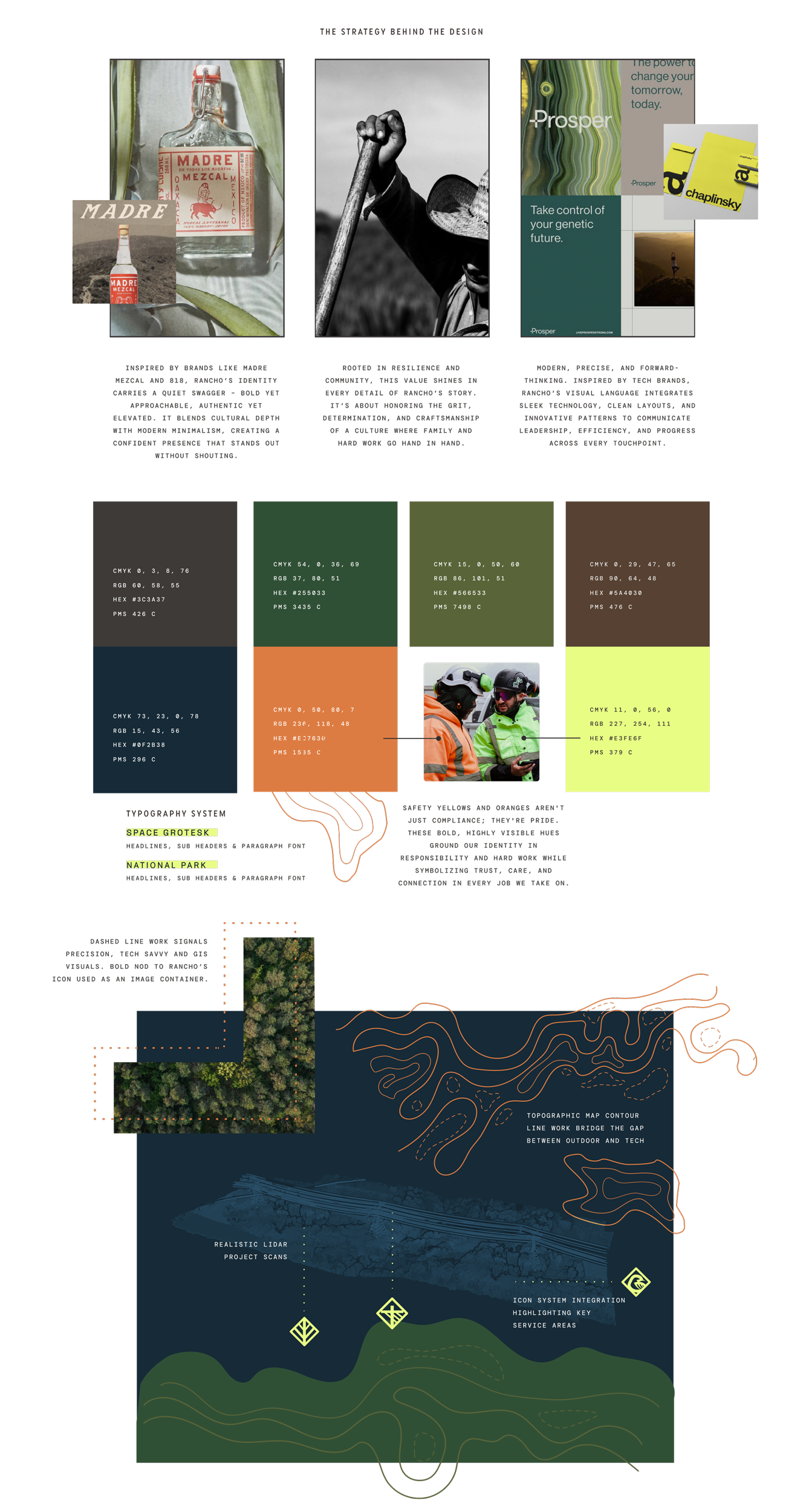
Visual Identity
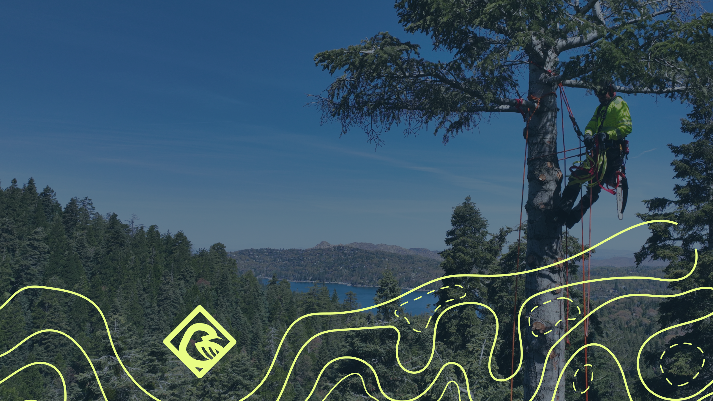
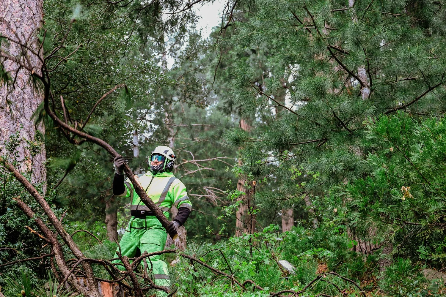
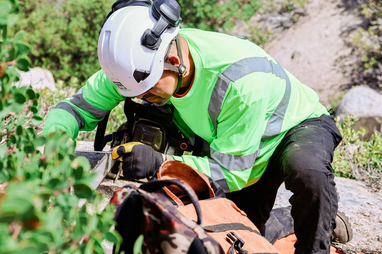
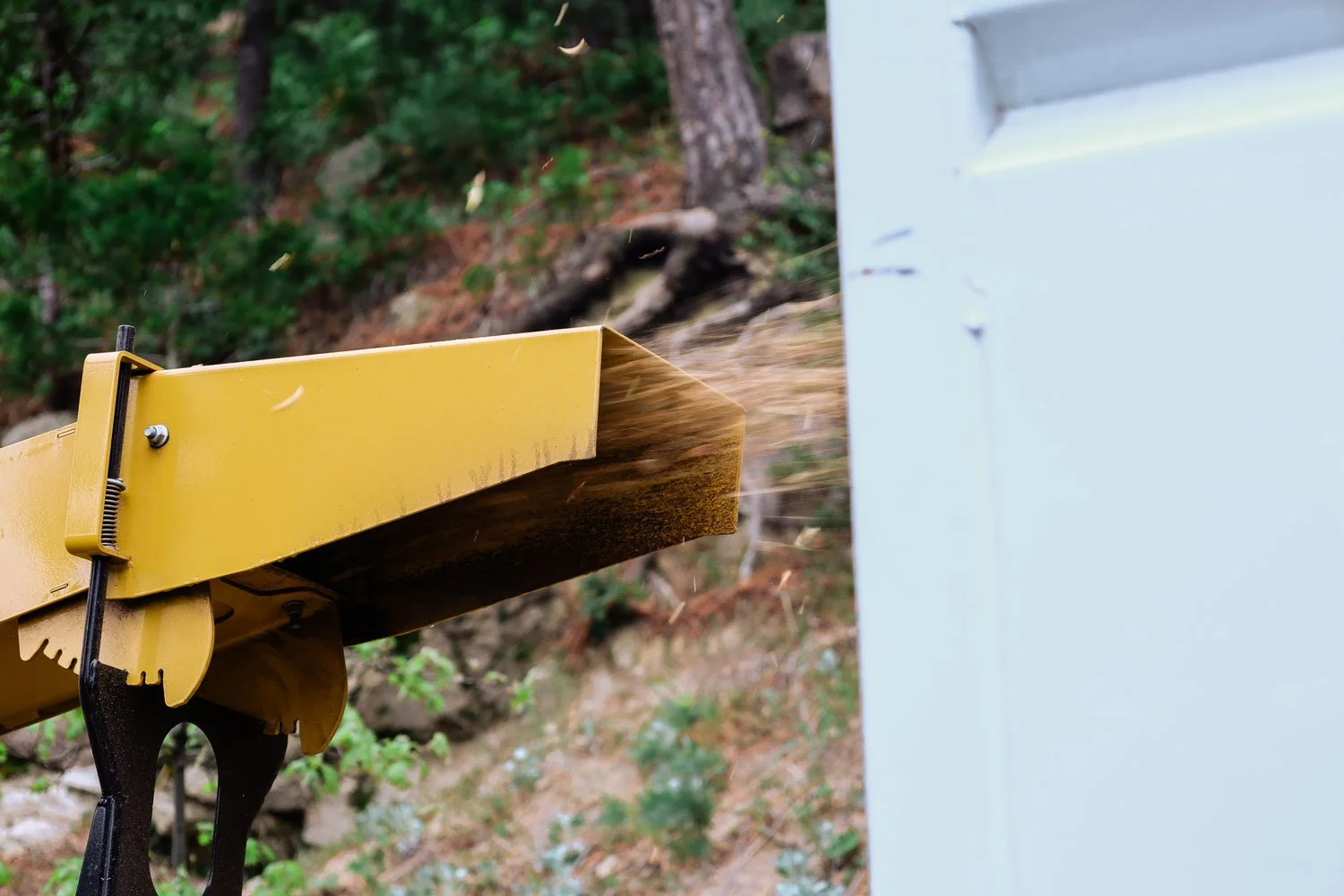
For Rancho Tree Service, differentiation could not be a simple cosmetic change. This is a company built in the field. Its work is physical, technical, dangerous, essential, and often invisible to the people who benefit from it. Utility vegetation management is not an industry that asks for much attention, but it supports some of the most important infrastructure in the west. Power lines stay clear. Communities stay safer. Crews move through hard terrain with discipline, experience, and precision.
So when we began shaping Rancho’s visual identity, the goal was not simply to make the brand look more polished. The goal was to build an identity that could hold the full weight of the company: its grit, its scale, its cultural roots, its operational sophistication, and its future-facing ambition.
Rancho’s previous service system relied heavily on color and repeated “R” marks to organize its offerings. The result was functional, but not especially meaningful. The colors felt disconnected from one another, and the icons did not create a clear visual relationship between the company’s services, values, and larger brand story. For a company expanding across regions, service lines, and utility partnerships, that system needed more structure. Our approach was to make every visual choice work harder.
The identity draws from the language of the field: safety gear, workwear, utility signage, terrain, equipment, and the physical reality of crews doing difficult work in demanding conditions. Safety yellows and oranges were not treated as regulatory colors alone. They became colors of visibility, pride, and presence. Deep greens grounded the system in land stewardship and vegetation management. Rugged textures brought in the feeling of labor, wear, weather, and endurance.
But Rancho is not only a “heritage” company. It is also a modern utility and environmental contractor investing in geospatial tools, drones, LiDAR, operational systems, and scalable infrastructure. The visual language had to express that side of the business too. Clean typography, structured layouts, technical patterns, and precise iconography helped bring forward a more advanced, capable, and future-minded Rancho.
That balance became the center of the work: rugged, but not rough. Modern, but not sterile. Cultural, but not ornamental. Confident, but not loud.
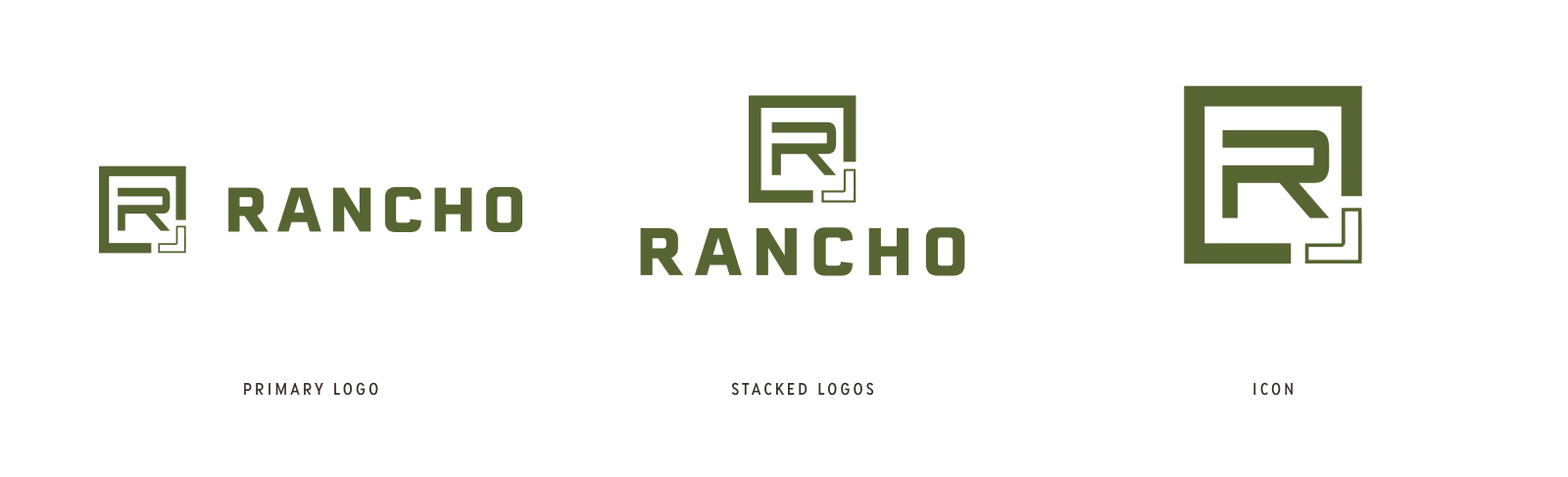
ICON SYSTEM STRATEGY:The icon system became one of the clearest expressions of that thinking.
Rather than using repeated marks or generic service symbols, we developed a family of uniquely identifiable icons that could help organize Rancho’s broad service offering on the website and across brand materials. Each icon was designed to function almost like a small logo for a specific solution. Together, they create a system that is easier to navigate, easier to remember, and more aligned with the company Rancho is becoming.
The consistent outer diamond shield shape carries a practical reference: construction signs, hazard markers, and safety symbols seen in the field. It gives the icons a common structure while reinforcing the world Rancho operates in. Inside that shape, each mark becomes more specific, representing individual services while still belonging to the larger brand family. That is where identity becomes more than decoration.
For Rancho, the design system had to reflect a company where heritage and innovation are not separate ideas. The same business that was built through family, grit, and hard work is also using advanced tools to serve utilities at a higher level. The same crews that understand the land through experience are now supported by technologies that map, measure, and improve the work.
The brand needed to make sense of all of that at once.
A strong identity does not just help a company stand out. It helps people understand what they are looking at. It creates order. It signals quality. It turns a scattered set of impressions into a recognizable system.
For Rancho, that meant building a visual language with the confidence of a modern brand and the backbone of a company that has earned its place the hard way.
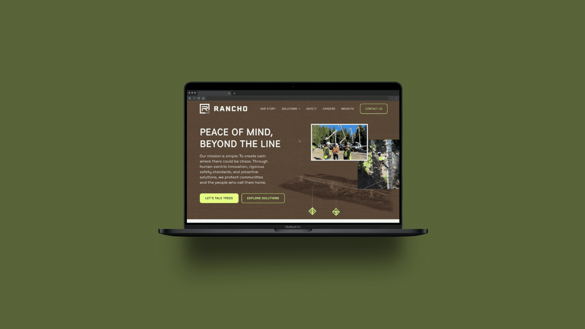
Website Design
Rancho’s website needed to feel closer to the field than the category typically allows. In an industry where many competitor sites feel corporate, interchangeable, and removed from the people doing the work, we wanted Rancho’s digital presence to carry the atmosphere of the outdoors: rugged, open, grounded, and real. The site needed to show the company as it actually operates, with crews, terrain, equipment, safety, and scale all working together to tell a more distinct story.
Structurally, the website had to serve multiple audiences with intention. Rancho’s services were organized into clear, distinct pages so each customer segment could quickly find the solution that matched their need, whether utility vegetation management, emergency response, environmental services, or geospatial capabilities. At the same time, the site needed to function as a recruitment tool, giving prospective team members a clear sense of Rancho’s culture, benefits, career opportunity, and long-term stability.
The Impact
331% increase in LinkedIn engagement year-over-year
National utility client inquiries from inbound traffic
Positioned for scalable growth across western U.S. markets
CLIENT REVIEW"Finding the right creative partner is a challenge. Purveyor made it easy. Shannon, Toni and the team sought to understand the nuance within our industry, our organization and our culture to help position our brand for scalable growth. Other agencies simply didn't have the desire or depth needed to understand us, our story and our commitment to our people. Purveyor elevated our visual presence, refined our voice to the world and allowed us to truly stand out from the herd of legacy organizations in our space."
Geoffrey Taylor – Vice President, Sales and Marketing