Vista Vineyards
About Vista Vineyards
Vista Vineyards exists because the leadership team saw what was missing. These are veterans who spent decades inside that fragmented system. They knew that retailers needed a company that controls the entire chain, owns the outcome, and stays accountable when the season changes.
When the company's table grape operations reached a tipping point, the team made a defining choice. They spun off to focus exclusively on what they do best: year-round table grape supply built on vertical integration, proprietary variety access, and leadership ownership. The capital structure that followed made it possible and the leadership team took equity to make it permanent.
Vista delivers uninterrupted supply that retailers can depend on. That means 52 weeks a year, across California, Mexico, and Peru. That requires farming, packing, and selling under one roof. It requires licensed access to Sun World® and BLOOM FRESH™ genetics across all three regions. And it requires a team whose financial stake aligns with every shipment.
This is the structure the category has always needed, built by the people who understand it best.
We wanted to help Vista Vineyards identity and clearly state their onliness and distinct position in the market, starting with foundational work, through to strategy and messaging, and into brand identity design.
vista vineyards Brand Scope:— Strategy
— Messaging
— Visual Identity Design
— Packaging Design
— Seasonal Lines Design
— Website Design
— Brand Collateral
— Tradeshow Design
— Brand Guidelines
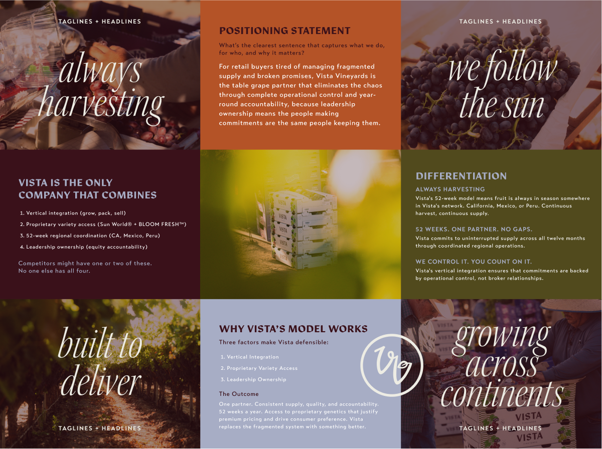
Strategy + Messaging
Grape suppliers talk like logistics companies. The assumption is that all grapes are interchangeable and that buyers choose based on price and availability. There's little brand equity. There's no storytelling. There's no differentiation between a broker with a Rolodex and a vertically integrated operator with year-round supply
The category has conditioned buyers to expect inconsistency and to treat table grapes as a fill-in-the-blank commodity. The few players with proprietary varieties have genetic advantage but still market themselves like everyone else. Operationally competent but strategically invisible.
Vista has operational control, proprietary variety access, and leadership ownership. Three advantages most competitors can't claim. But the bigger opportunity is showing up as a brand in a category that has conditioned buyers to expect suppliers, not partners. Reliability as a positioning platform. Consistency as innovation. 52- week supply as a strategic moat.
We narrowed down Vista’s three main strategic opportunity areasPosition reliability as the rare commodity in a volatile category. Vista becomes the partner retailers can't afford to lose.
Create a brand and sub-brands consumers ask for by name. Strengthens retail partnerships, reduces dependency on transaction buyer relationships.
Become the industry voice on why vertical integration matters. Vista becomes the reference point for modern supply chains.
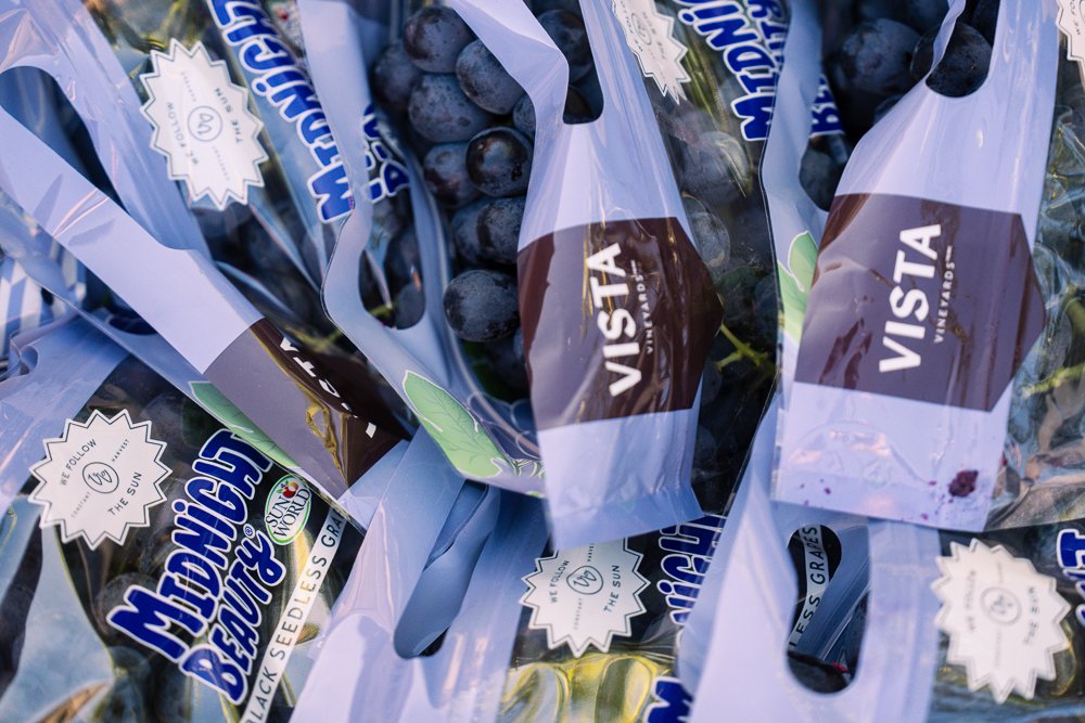
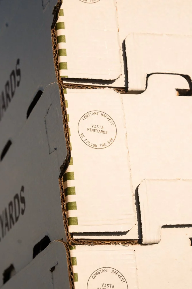
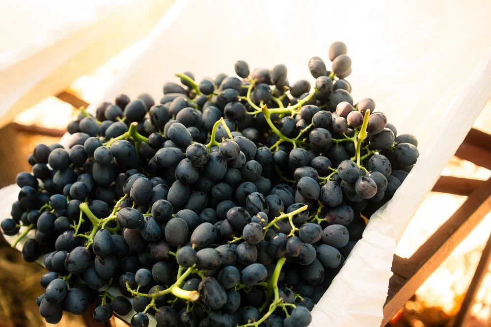
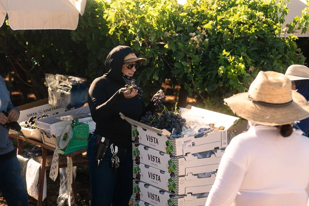
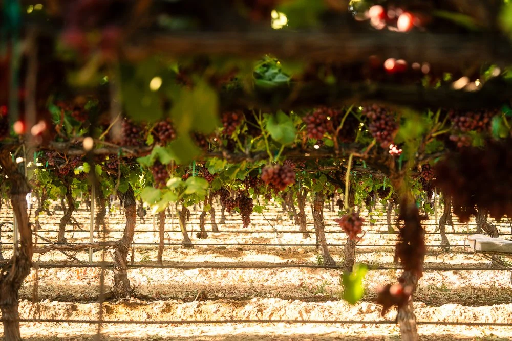
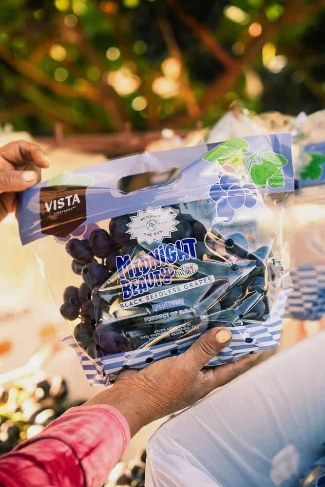
Photography by Luxeclub Visual Identity
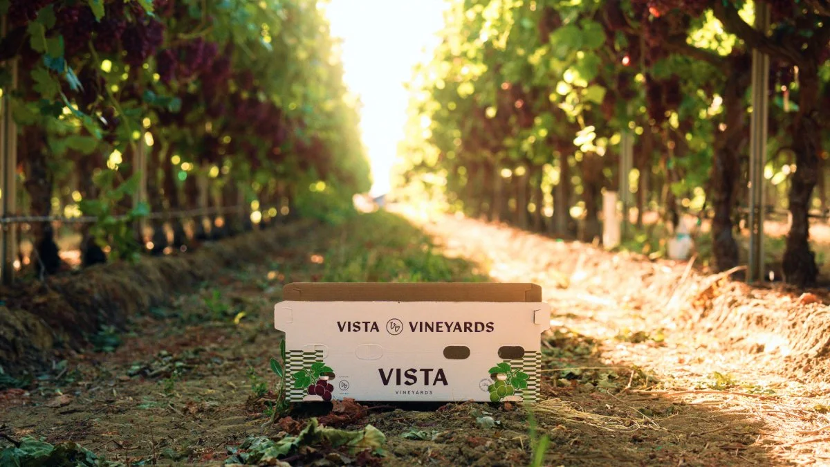
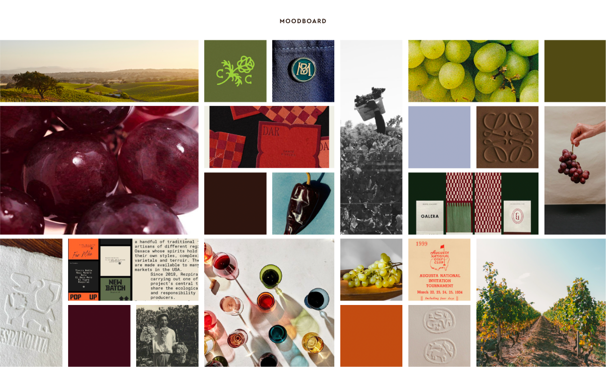
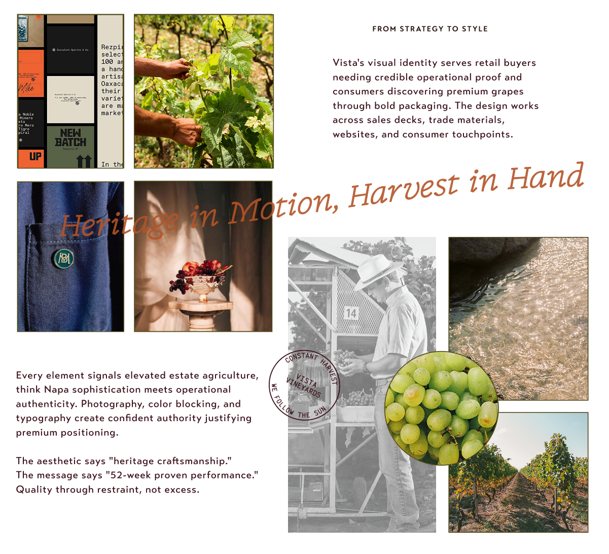
We can sum up the creative strategy for Vista’s brand design in one statement: Heritage in Motion, Harvest in Hand. The system mirrors Vista's operations—constantly shifting between regions, seasons, and harvest windows. Color blocks create rhythm. Typography moves from bold to refined. Photography shows agricultural movement illuminated in golden light.
So, how does Vista Vineyards’ brand personality, tone, and strategic positioning translate into specific visual design decisions? Vista’s identity is built on five personality traits, each with clear visual implications:
Grounded Operator (confident typography, clean layouts, real photography over illustration)
Long-Term Builder feel (premium materials, restrained color palette, timeless over trendy)
Straight Shooter approach (clear hierarchy, no clutter, type and image working together)
Partnership-Oriented warmth (approachable but professional tones)
Quietly Confident restraint (generous white space, quality signaled through simplicity rather than complexity)
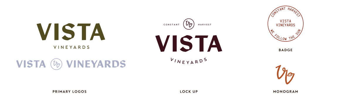
Vista Vineyards' visual identity needs to serve both retail buyers seeking credible operational proof and consumers drawn to premium packaging, working consistently across sales decks, trade materials, websites, and consumer touchpoints. The overall aesthetic aims to blend "Napa sophistication" with operational authenticity — heritage craftsmanship paired with a message of proven, consistent performance, positioning Vista Vineyards as a premium brand through restraint rather than excess.
Packaging Design
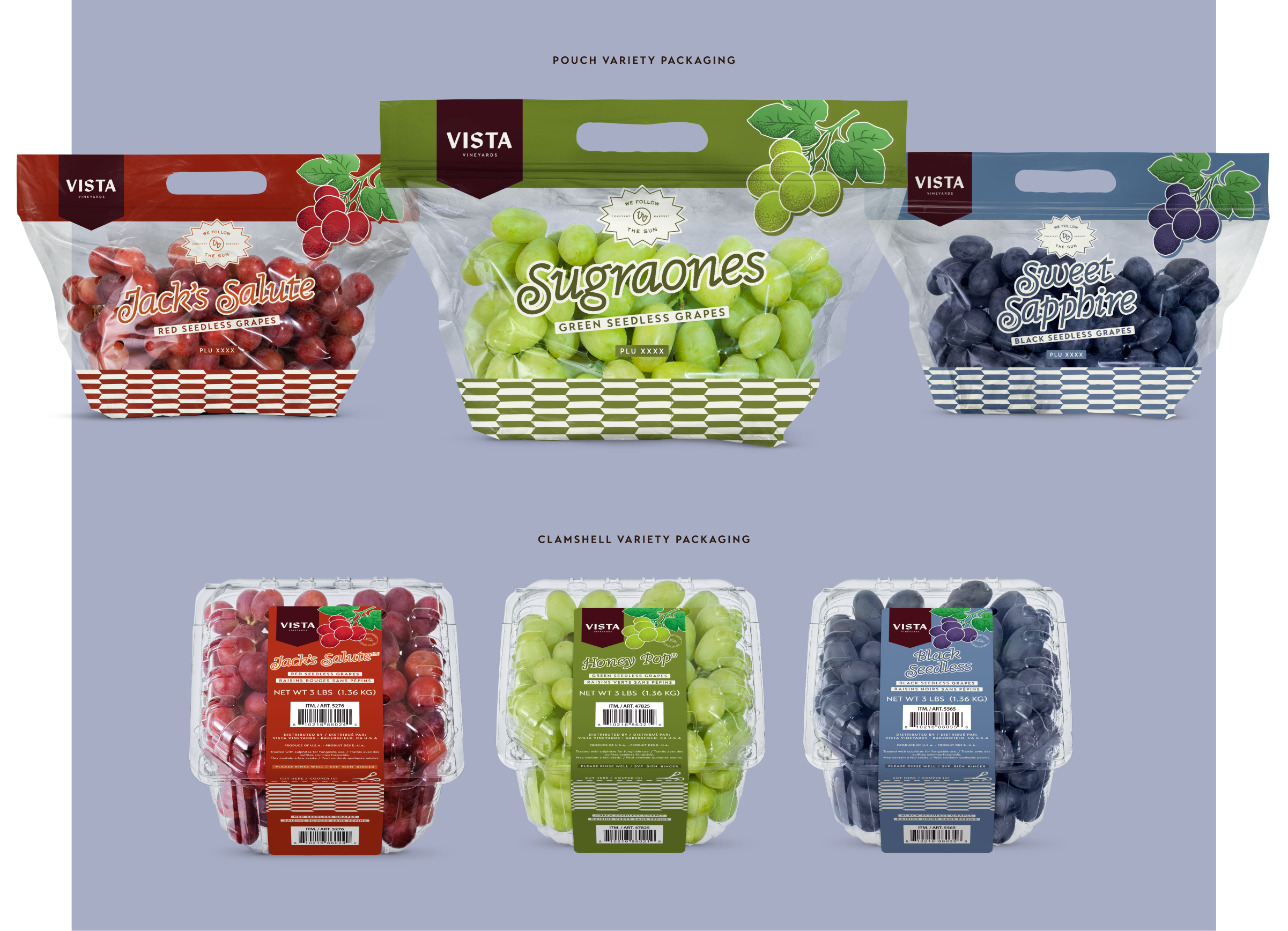
Packaging design followed quickly once the foundational brand work was set. The challenge this time was carrying that same tone into customers’ hands and onto their kitchen counters. We channeled Vista’s grounded heritage through a slanted typeface with curly capitals, crate-style produce labels, a ribbon-wrapped logo, and a fishbone pattern, then modernized it all with clean edges and minimal illustrations.
Vista also proposed two seasonal table grape lines to surprise and delight its customers in a whole new way. The summer line aimed to attract millennials, while the fall line was designed to catch the eyes of kids and parents looking for a healthy alternative to Halloween candy.
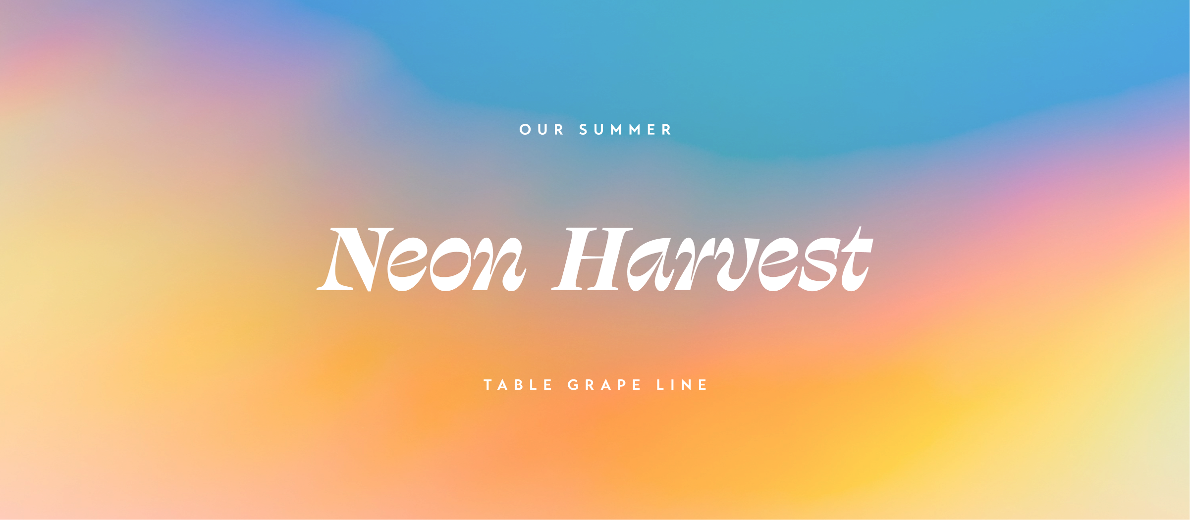
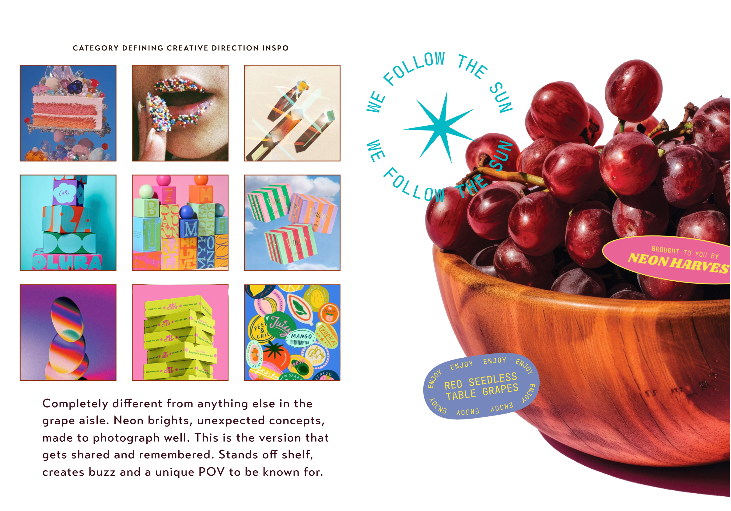
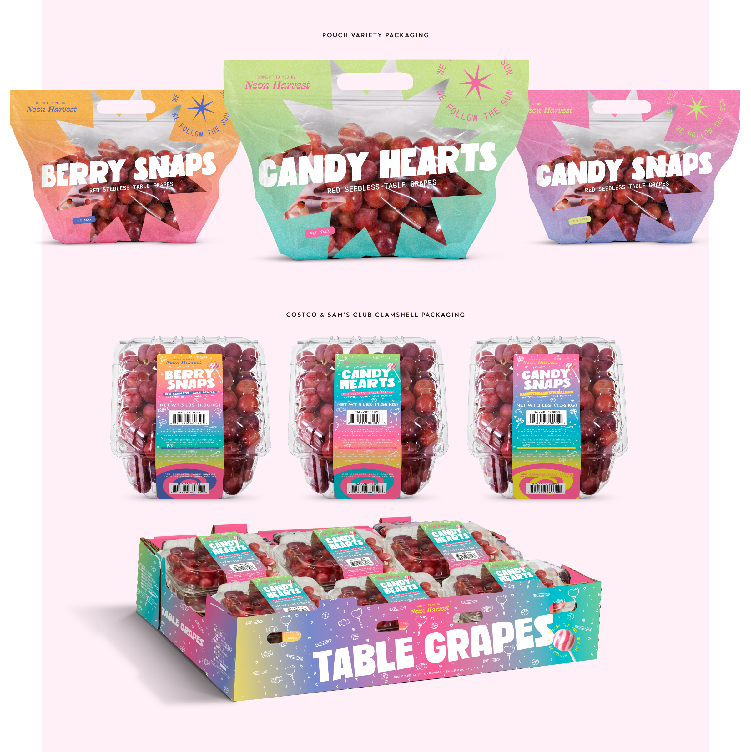
Neon Harvest - Summer table grape lineBig-box retail environments are highly competitive, where products are displayed on pallets and concrete floors, shoppers move quickly, and purchasing decisions are often made in a matter of seconds. In this setting, conservative branding tends to blend into the background. Brands that command attention through bold, memorable packaging are the ones that stand out and earn a second look.
Neon Harvest was created around this philosophy. Rather than following the visual conventions of the grape category, we helped Vista set out to develop a brand that feels entirely unexpected—one that immediately captures attention and establishes a distinct point of view. Vibrant neon color palettes, unconventional pouch window shapes, and packaging designed to photograph beautifully. The result is a grape line that breaks through the visual clutter, generates conversation both in-store and online, and establishes a memorable identity shoppers can instantly recognize and return to.
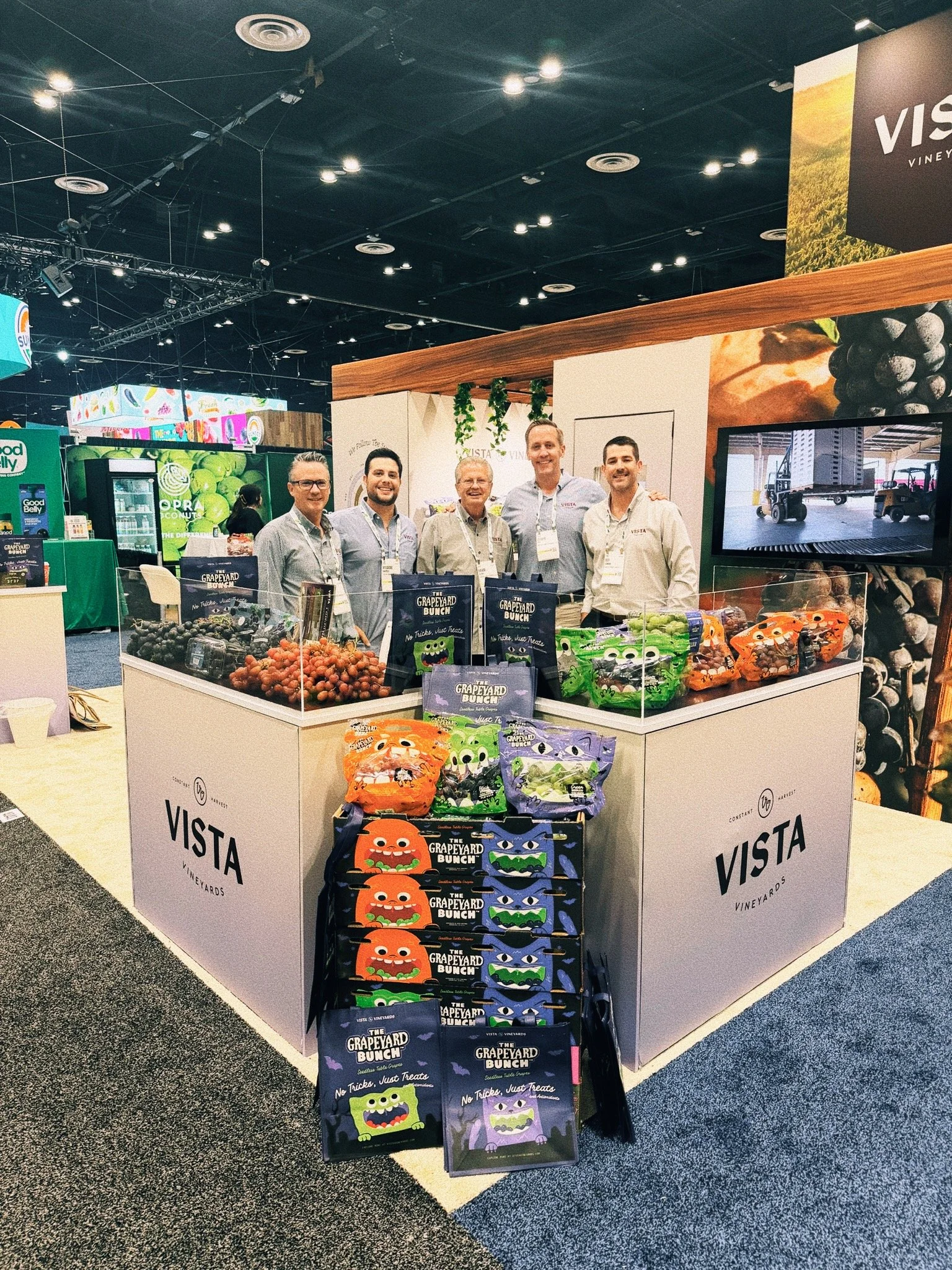
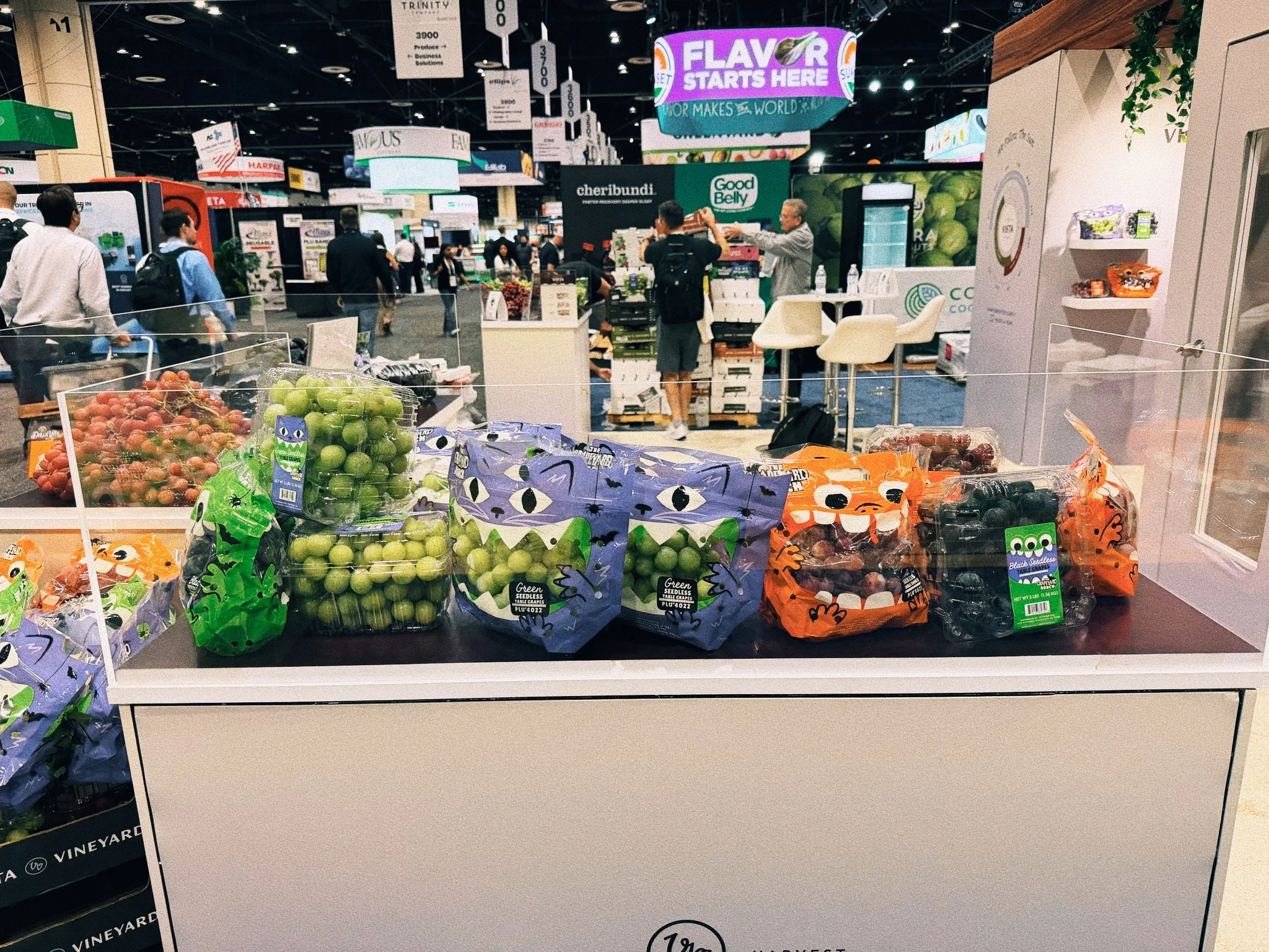
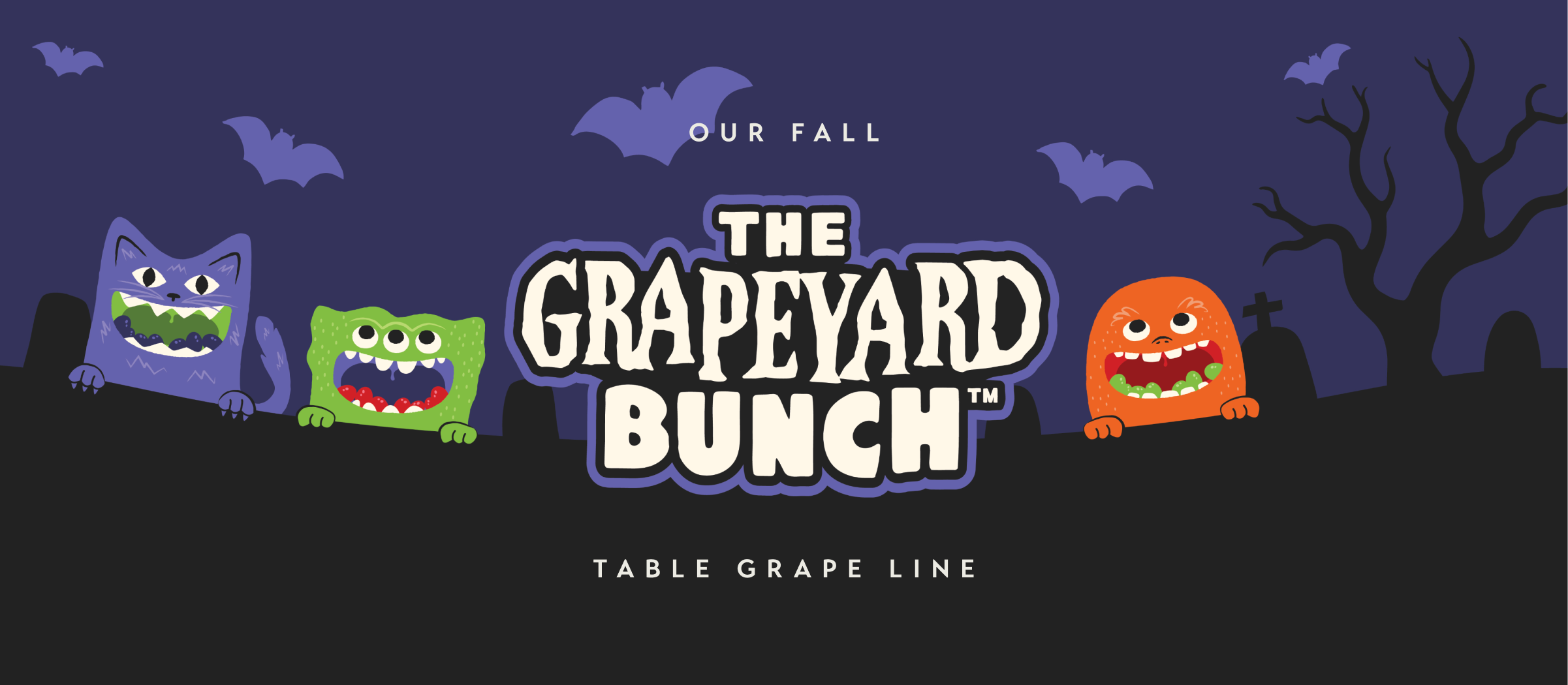
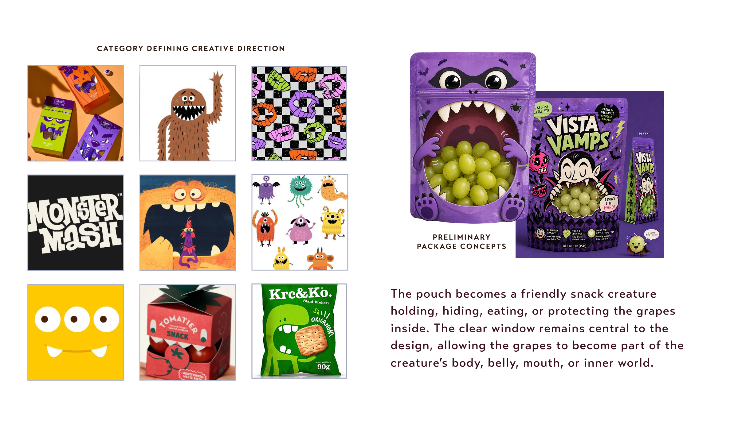
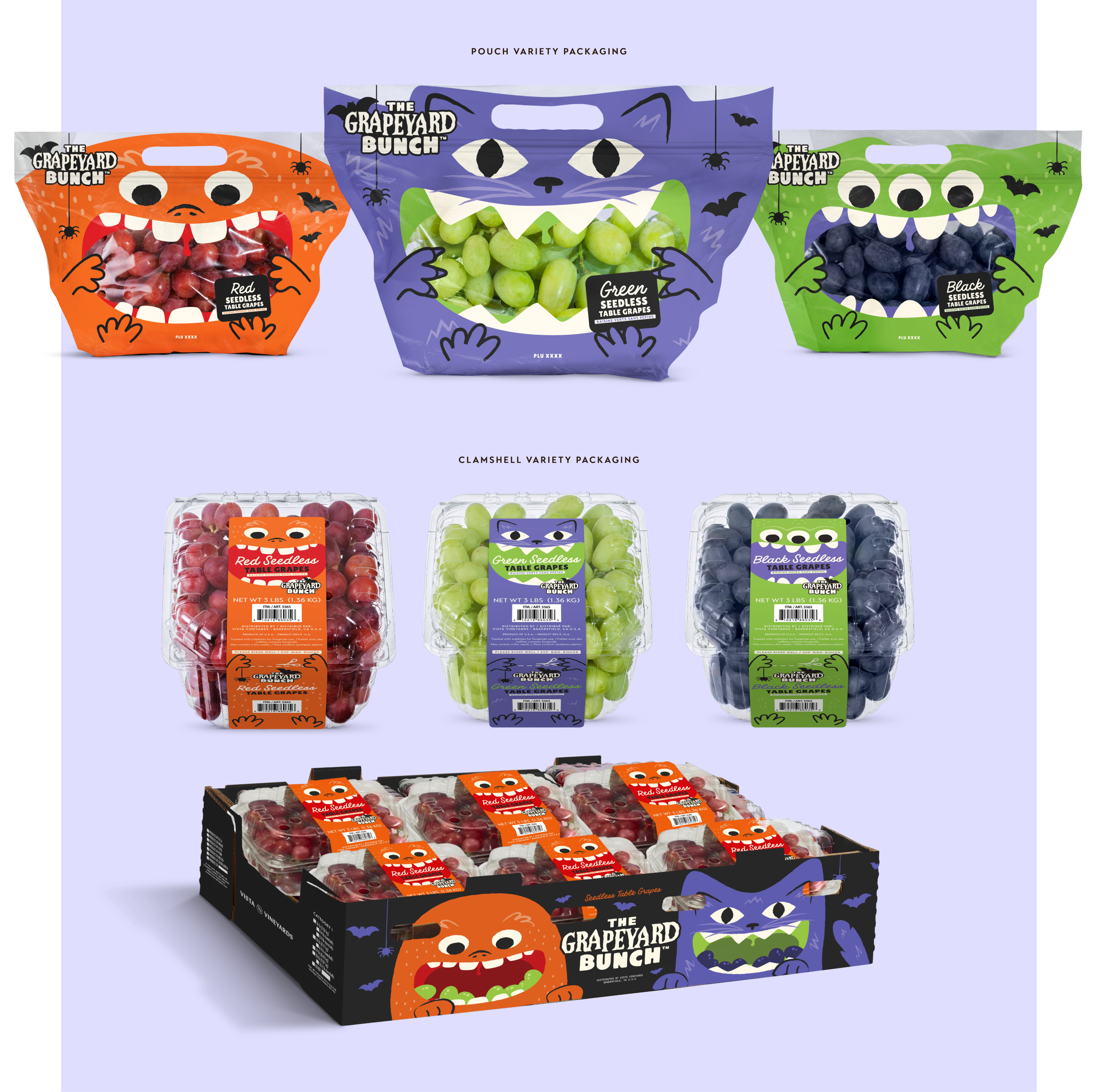
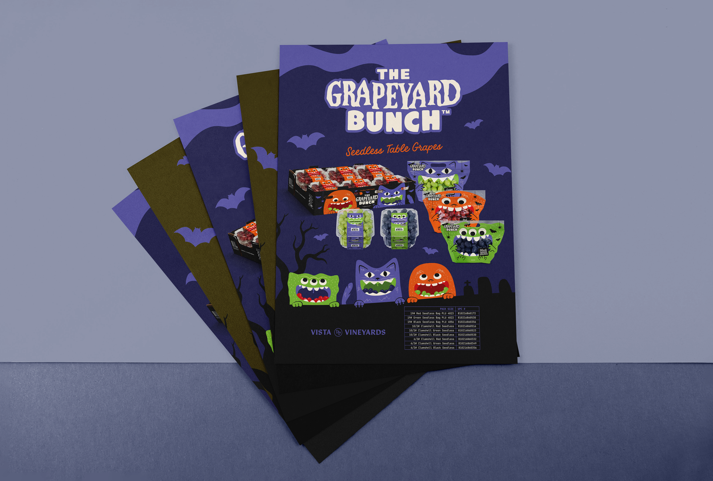
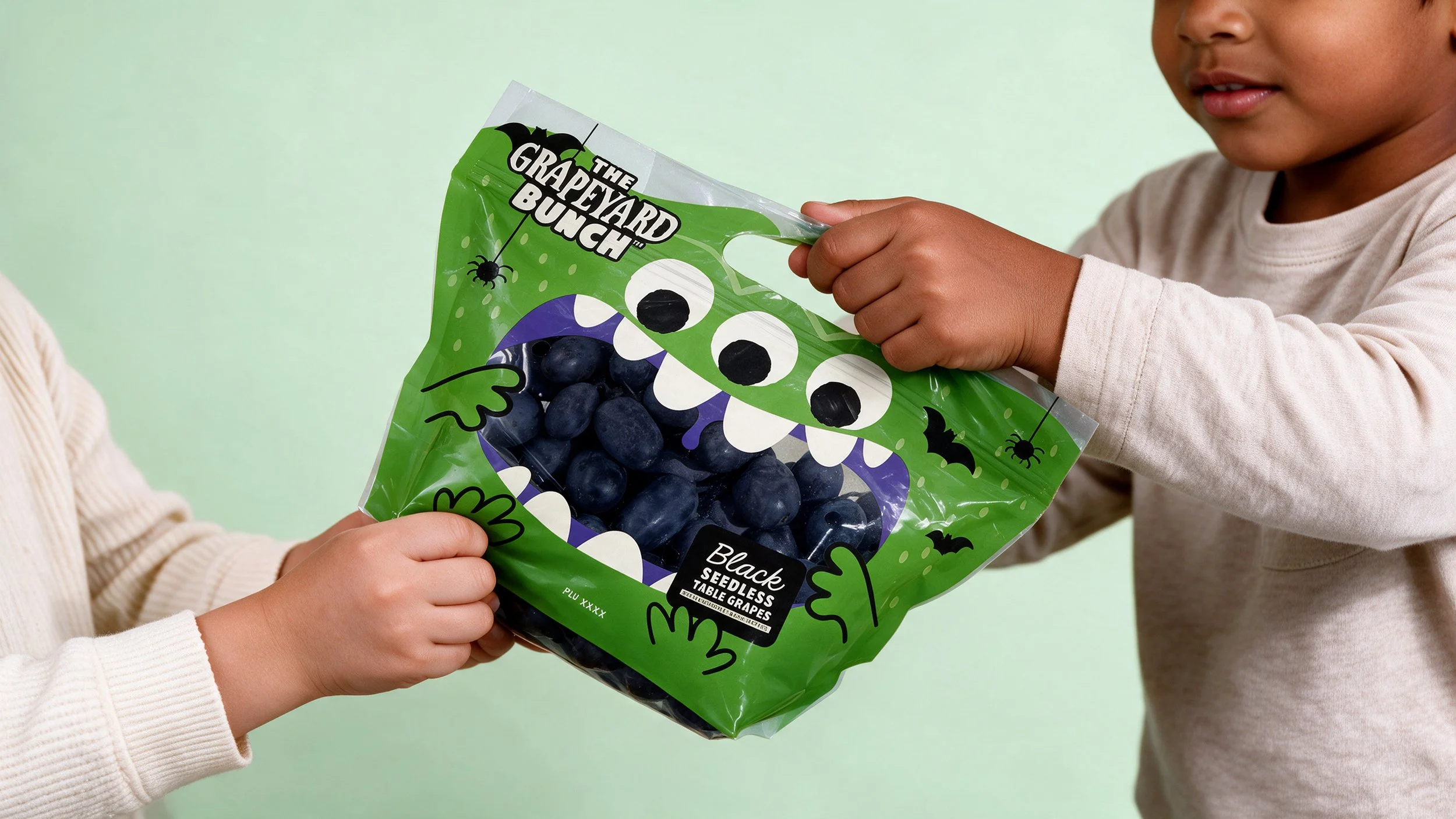
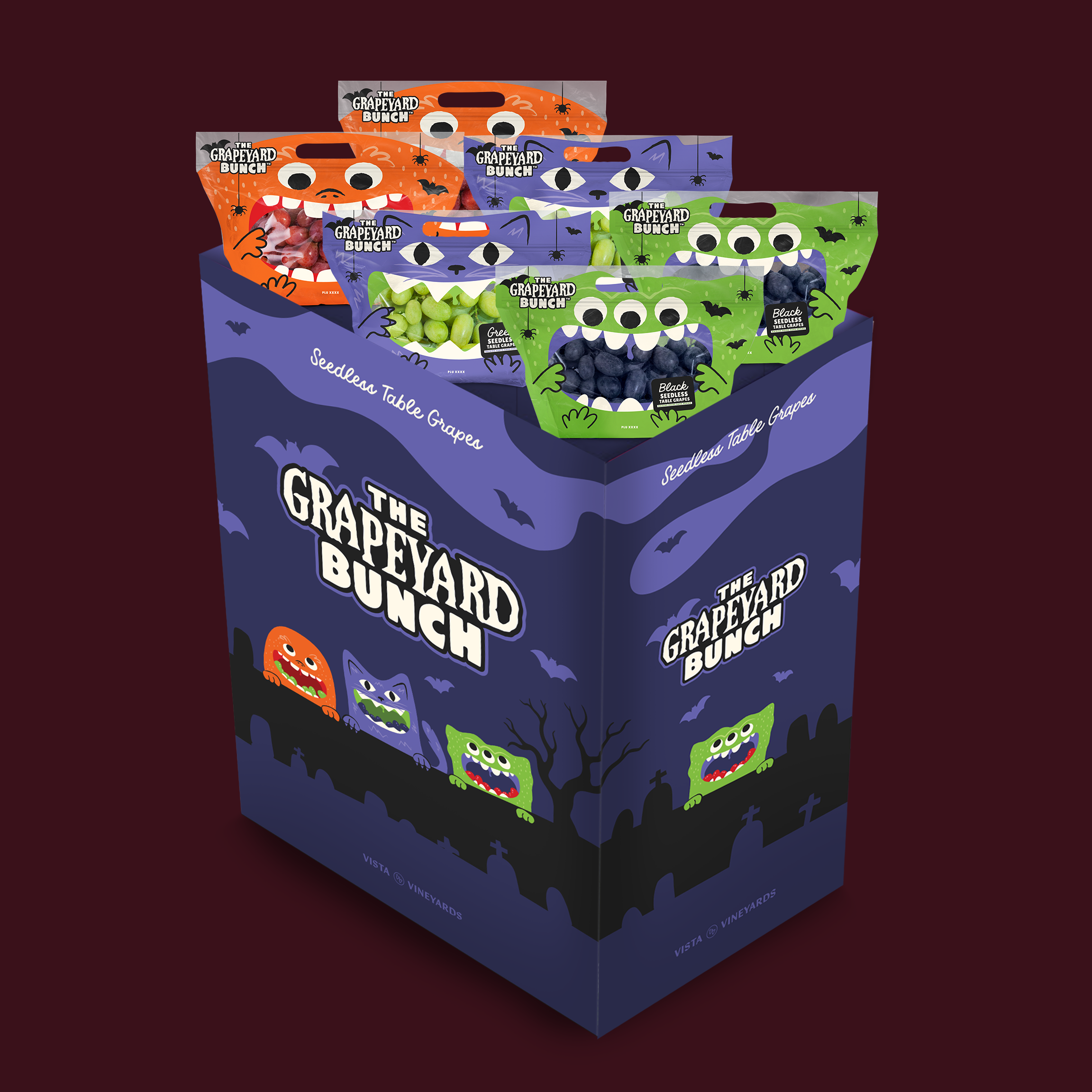
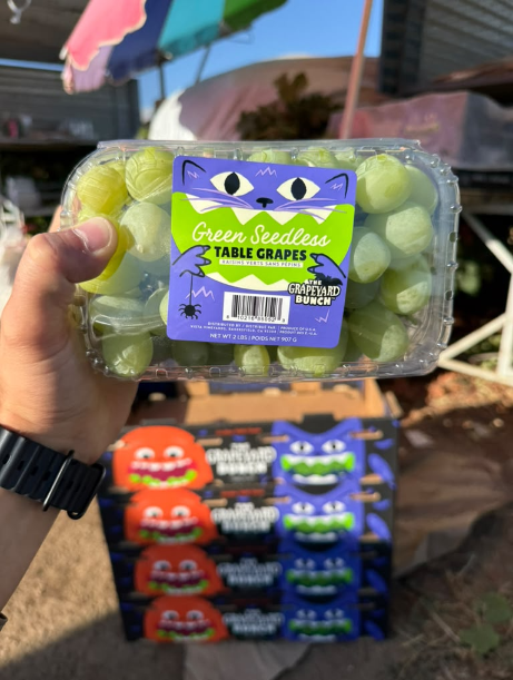
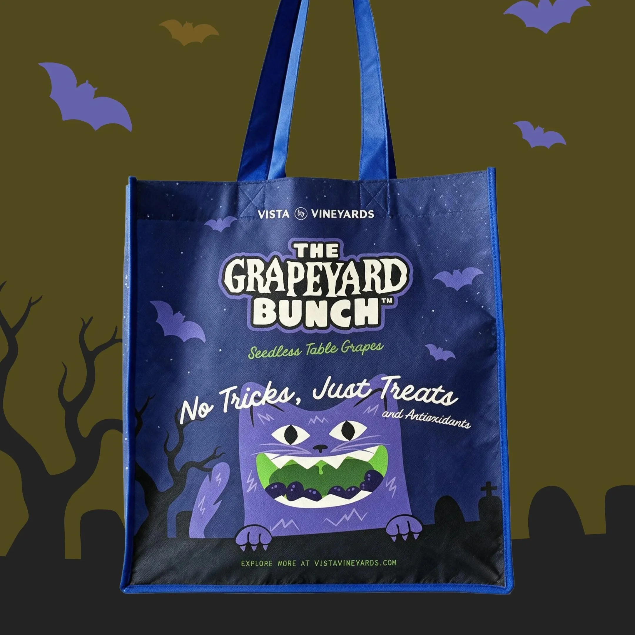
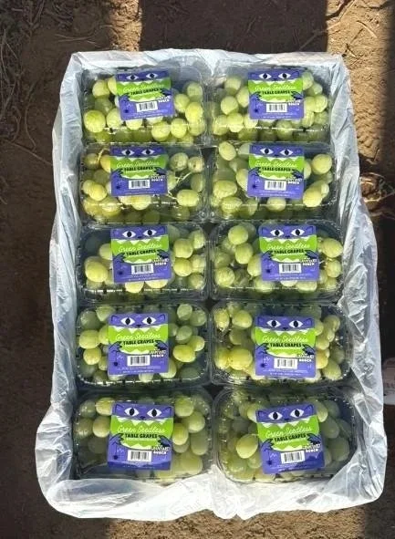
The Grapeyard Bunch - Fall table grape lineWe helped Vista craft their character-driven Halloween grape line from start to finish – variety name creation, logo design, disruptive packaging design, and supporting marketing materials. The Grapeyard Bunch resonates with children while maintaining a level of sophistication, holiday spirit, and wellness that appeals to millennial parents without forcing them into the candy aisle. It introduces a playful, family-friendly world of charming, expressive snack creatures that feels instantly recognizable, approachable, and distinctive on shelf.
By turning each bag into a character, the packaging becomes more than a container—it becomes part of the storytelling experience of The Grapeyard Bunch. This creates stronger shelf impact, encourages repeat recognition, and establishes a scalable seasonal platform that can evolve year after year.
animated email signature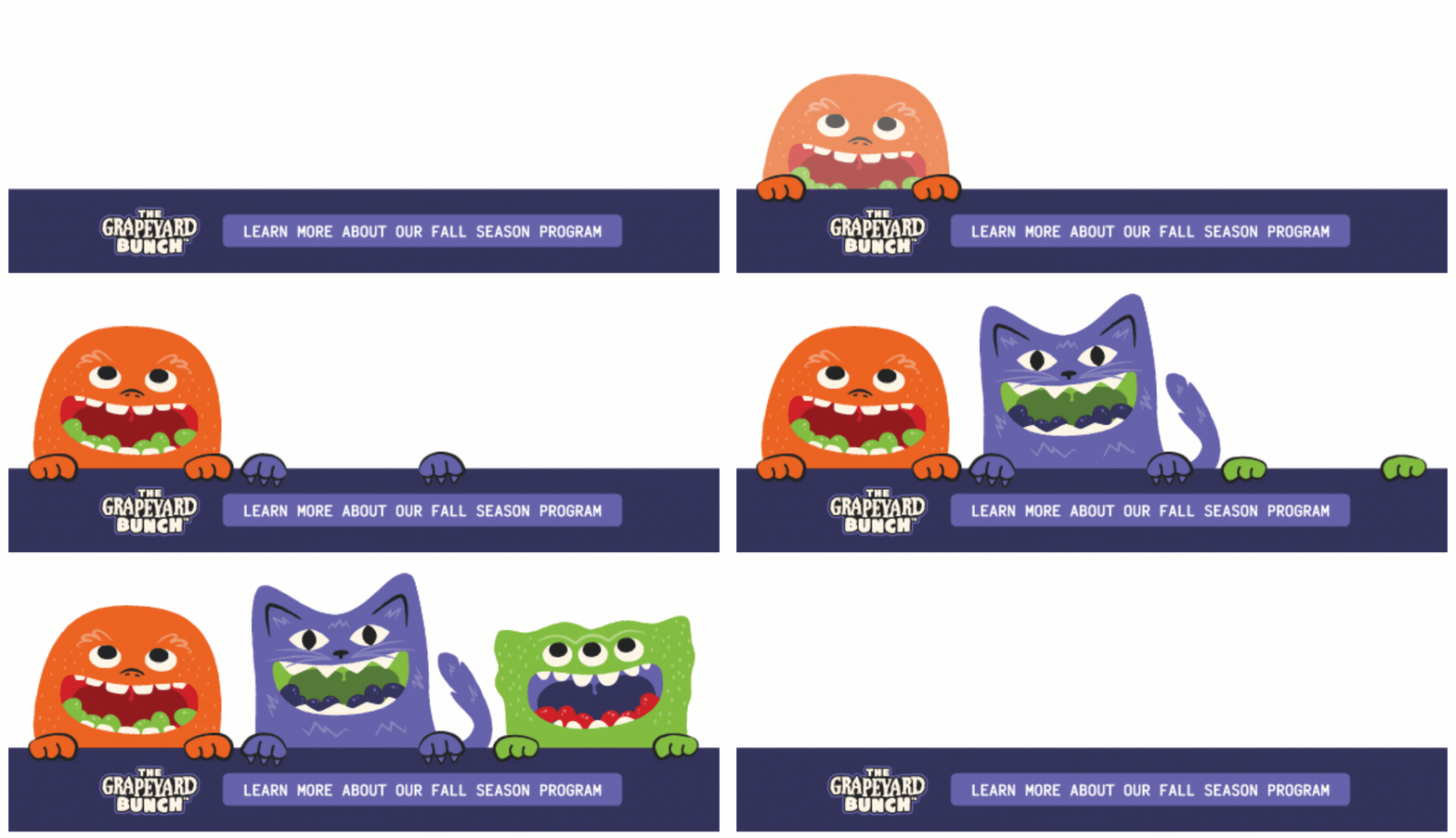
animated SOCIAL DESIGN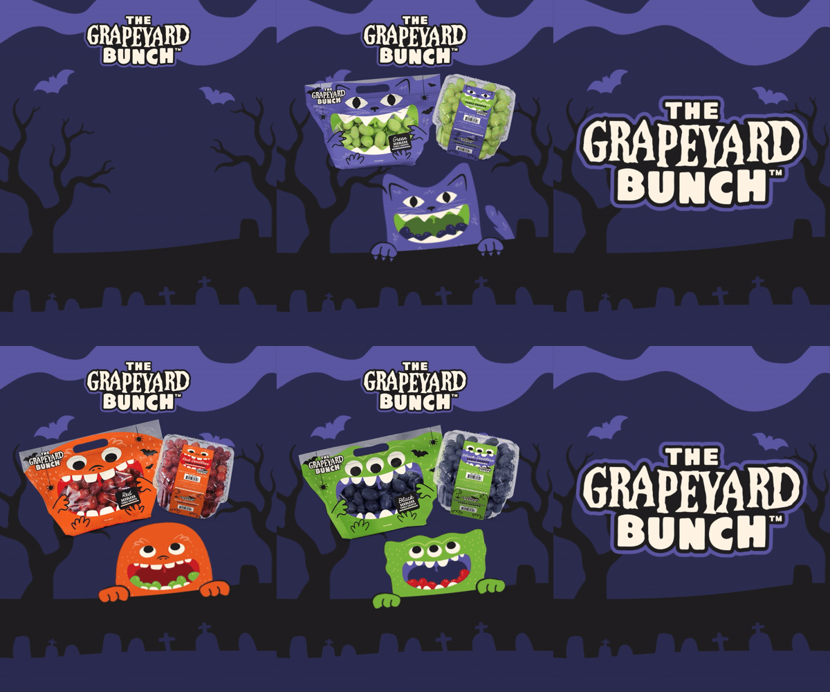
Website Design
The website came rather naturally as the clearest digital expression of Vista’s next big touchpoint. We maintained the elevated, editorial appeal of the brand with wide open breathable sections, precise produce cutouts, full-bleed golden hour photography, cascading animations revealing content gradually, and bold gradient blocks with an immersive brand extensions page. And the heritage black-and-white imagery with circular badges helps to infuse their more grounded, grass roots ag attributes.
A key priority was showing the expression of their year-round availability, various continent coverage and robust variety offerings. The varieties page required a unique developed build with multiple filters for color, region, availability and brand in effort to help buyers home in on exactly the right varietal. The site all came together seamlessly providing Vista with a website presence that balances their established, confident tone with just enough surprising, ultra-modern details.
See for yourself at www.vistavineyards.com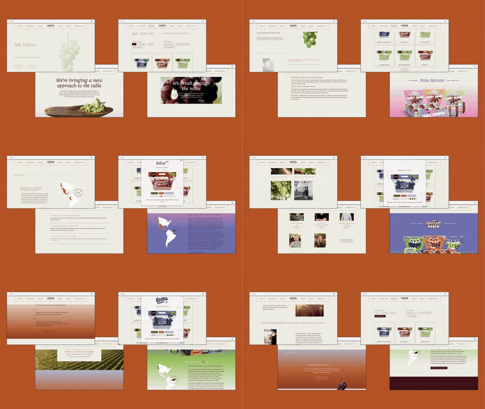
Tradeshow Booth Design
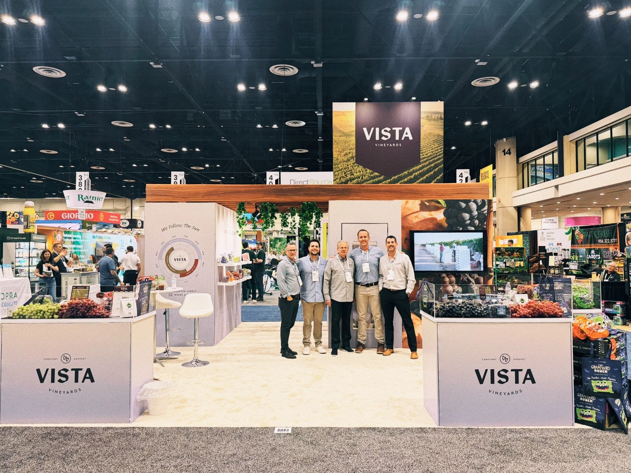
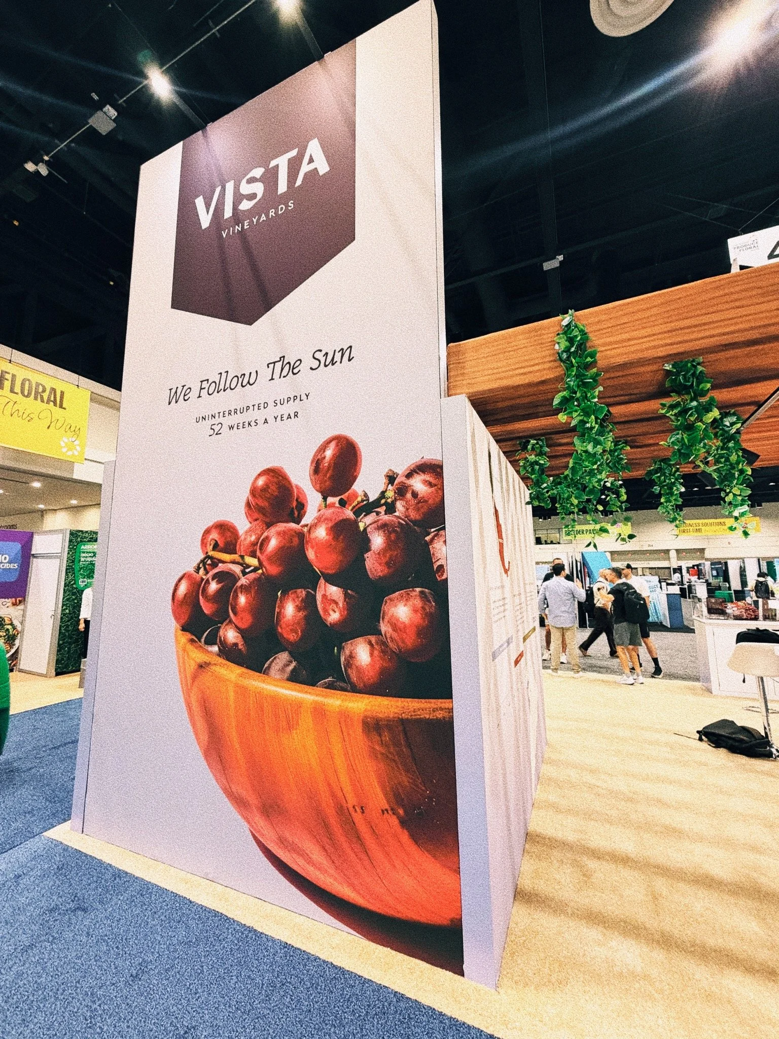
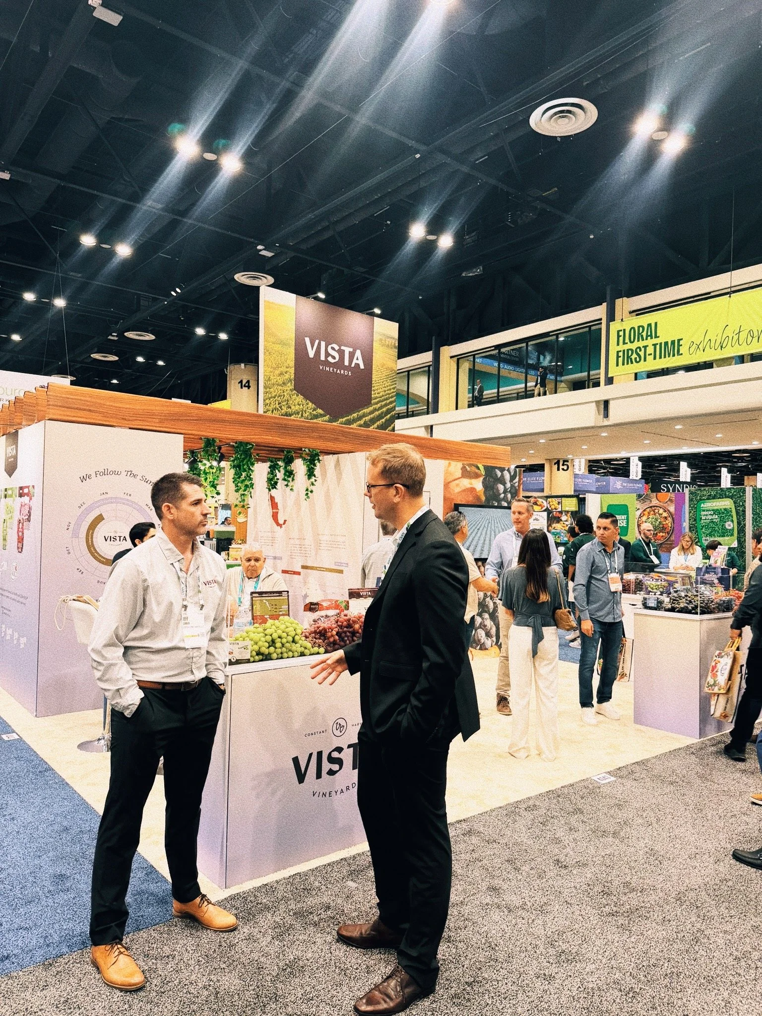
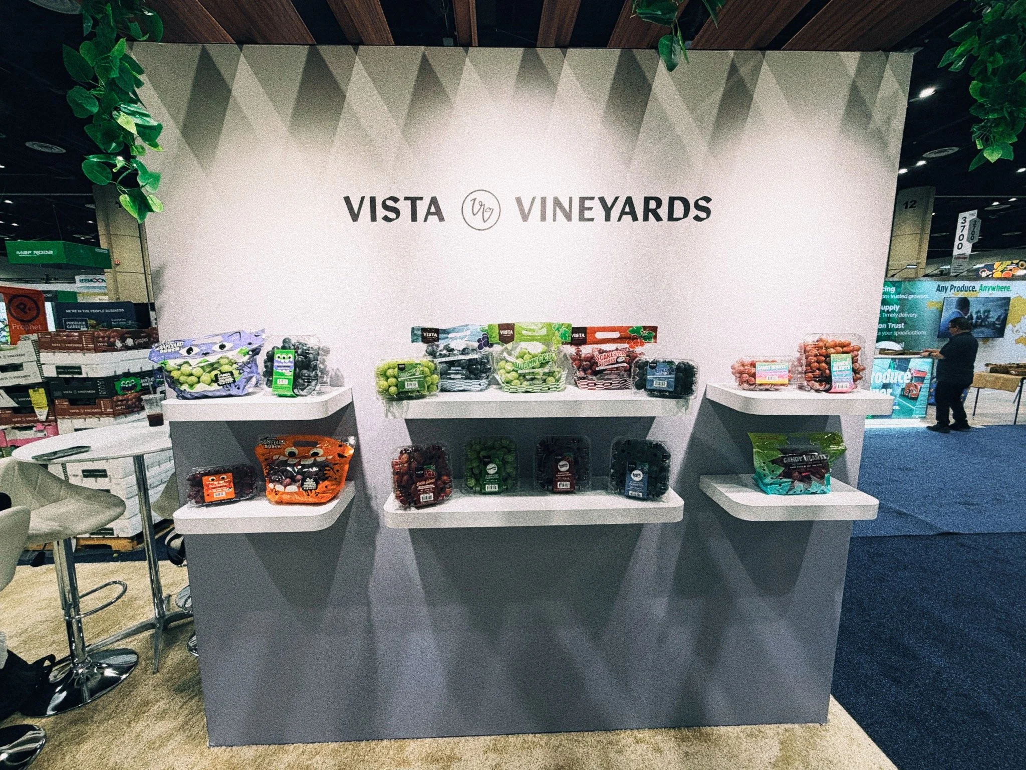
Vista's first trade show, IFPA's Global Produce & Floral Show went off with a bang! We designed their trade show booth to bring “Heritage in Motion, Harvest in Hand” to life as a physical space. Bold gradient color blocks rhythmically divide the structure, echoing the shifting regions and seasons of their operations. Large-scale, real photography of agricultural movement, bathed in golden light, anchors the space in place of illustration or stock imagery, signaling the grounded, hands-on operator behind the brand.
Premium, tactile materials such as warm wood, and natural textures, paired with real grapes and packaging on display. Generous white space and open sightlines let quality speak through simplicity, while a welcoming meeting area with comfortable seating and approachable, professional touches reflects Vista’s partnership-oriented warmth and invites real conversations rather than hard sells.