Moo Scratch Kitchen
Moo came to us at a pivotal moment. After more than 16 years in Bakersfield, the beloved neighborhood restaurant was preparing to leave its longtime Truxtun Avenue location and begin a new chapter in the heart of downtown. This was more than a move, it was an opportunity to clarify what Moo had always been, introduce what it was becoming, and create a brand experience worthy of its ambitious new home.
We were immediately drawn to Moo’s individuality. Its scratch-made menu was expansive, unexpected, and deeply personal. From house-ground burgers and handcrafted ice cream to chilaquiles, fresh-baked bread, cocktails, and catering. The food was playful without being gimmicky, skillful without feeling inaccessible, and backed by years of genuine community loyalty. Moo had never been interested in chasing trends; it had earned its place in Bakersfield by consistently making memorable food with real ingredients and real effort.
The challenge was that the brand’s public-facing identity no longer communicated the full experience. The name “Moo Creamery” led many people to think of Moo primarily as an ice cream shop, despite its broad, all-day menu and sophisticated scratch-kitchen operation. Moo needed our expertise across strategy, positioning, naming, messaging, visual identity, environmental expression, collateral, social media, and website design. Our role was to bring clarity and consistency to every touchpoint while preserving the warmth, history, and personality its longtime guests already loved.
Moo Scratch Kitchen Brand Scope:— Strategy
— Messaging
— Brand Identity
— Brand Guidelines
— Environmental & Interior Design Direction
— Brand Experience
— Brand Collateral / Merchandise
— Website Design
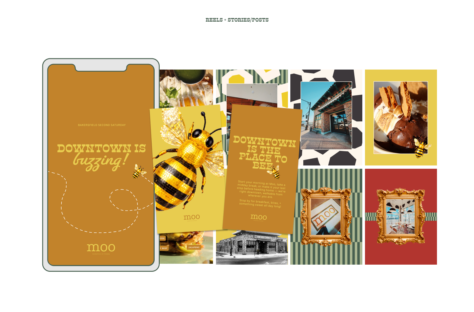
— Social Media Design

How It Started
Founded in 2008, Moo began as a small Bakersfield neighborhood restaurant built around a simple belief: good food should be made with care. Owners and chefs Jess and Sonia grew the concept from recipes developed in a small apartment kitchen into one of the city’s most recognizable local dining destinations.
Today, Moo Scratch Kitchen is a full-service, from-scratch restaurant offering everything from breakfast and dinner to baked goods, handcrafted ice cream, cocktails, and catering, all under one roof and made for every kind of occasion.
Moo supports Bakersfield by investing in the people, producers, and places that make the community distinctive. The restaurant sources locally whenever possible and highlights relationships with regional partners including Kirschenmann Farms, Gless Ranch, Billings Ranch + Almonds, Benton’s Meats, and City Bean Coffee.
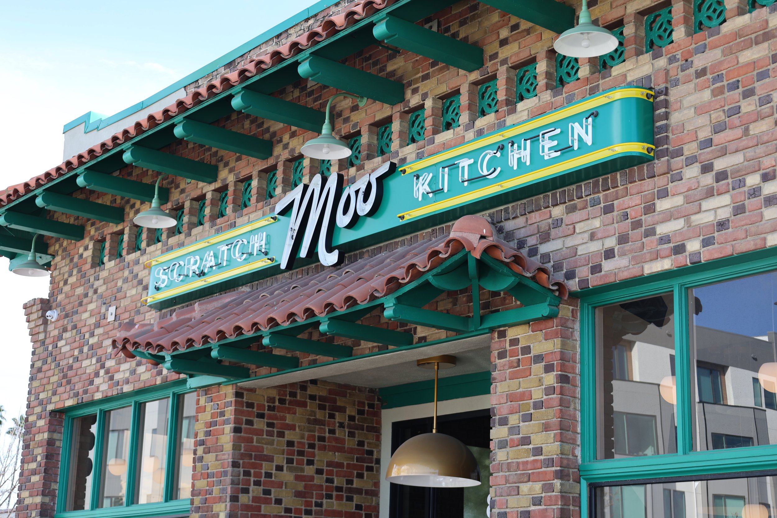
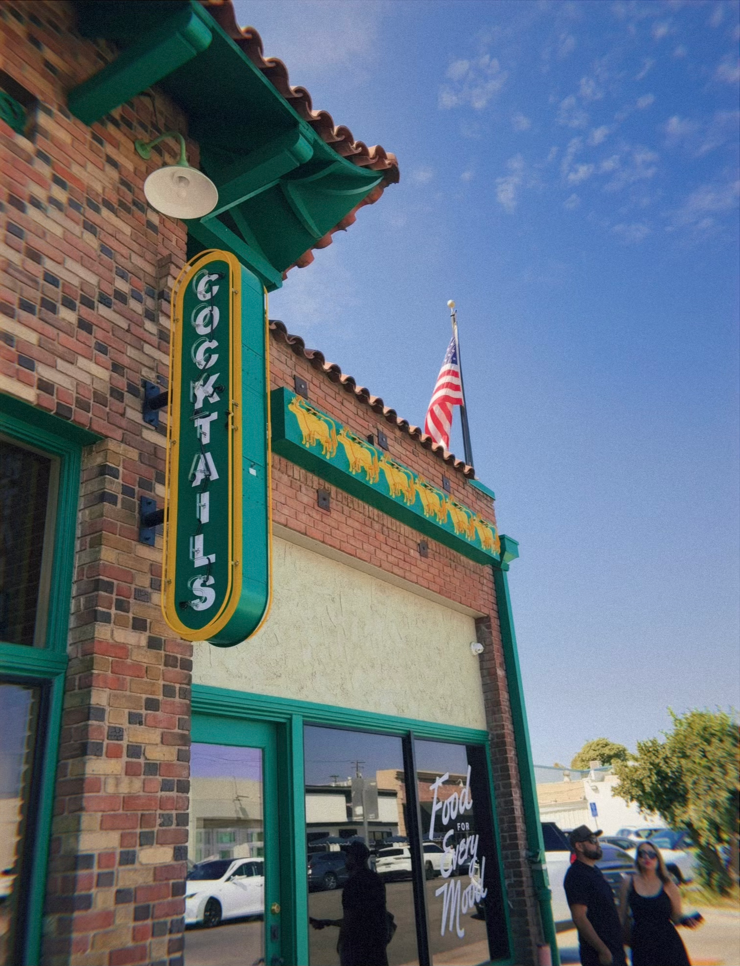
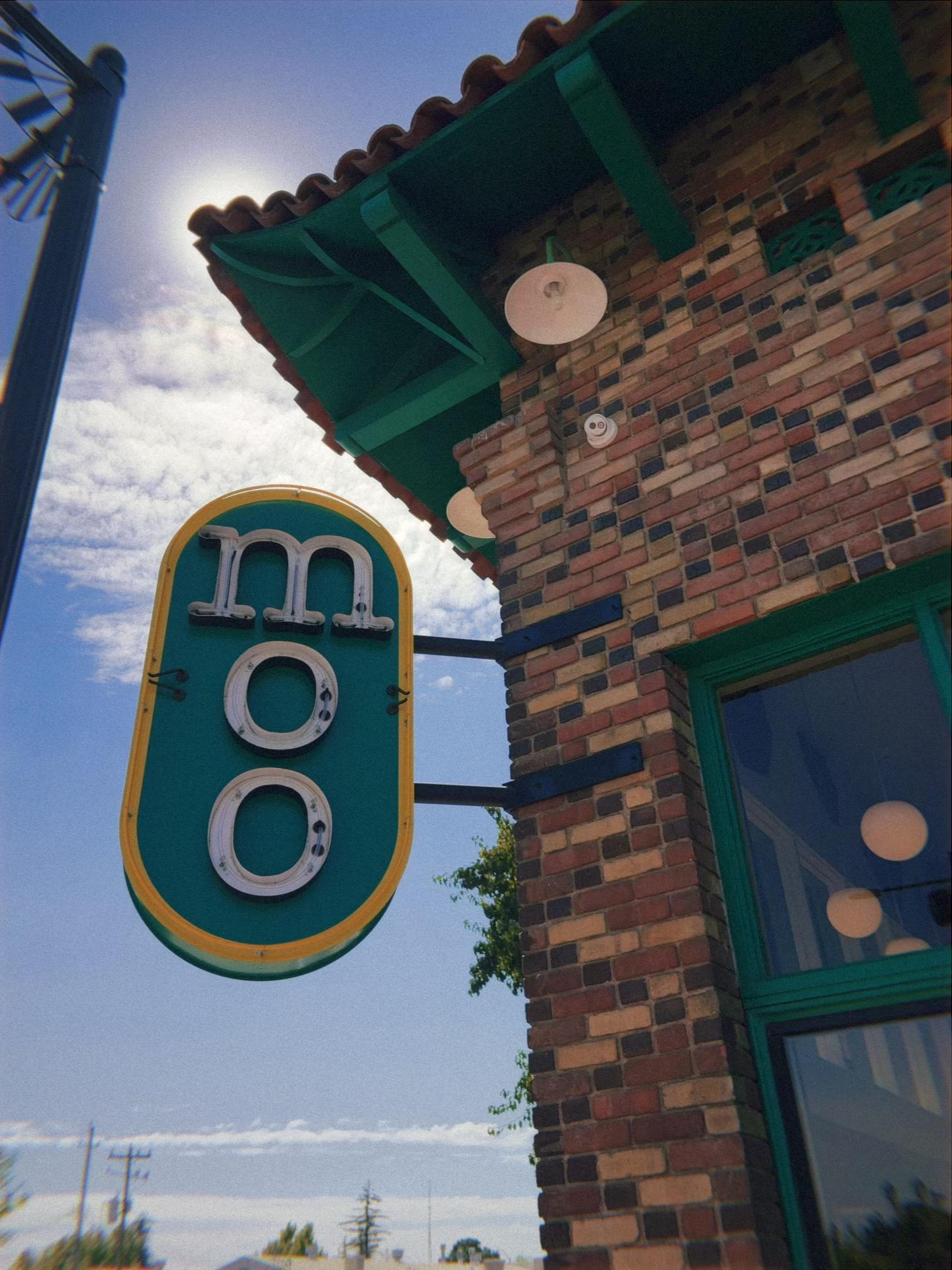
Its move downtown represented another meaningful investment in the city. Moo restored a historic 1928 building that originally opened as the New China Cafe in an area once known as Bakersfield’s New Chinatown. The building’s distinctive roofline and architectural details still reflect that history, giving Moo the opportunity to honor the character of the original space while bringing new energy to the neighborhood.
The move also placed Moo within a growing downtown residential community and created a gathering place for longtime regulars and new visitors alike. Rather than leaving its history behind, Moo carried the same care, personality, and hospitality into a building with a meaningful story of its own.
Moo’s community impact is rooted in hospitality. It remembers familiar faces, welcomes new ones, celebrates local collaborations, and creates food for a wide range of preferences, lifestyles, and occasions. The business does not simply operate in Bakersfield. It reflects Bakersfield.
Strategy and Messaging
Our ultimate goal was to help Moo evolve without losing the equity it had earned over more than a decade. The brand needed to reassure longtime guests that the Moo they loved was not disappearing while clearly communicating that the downtown location offered a larger, more complete experience.
The biggest strategic shift was the evolution from Moo Creamery to Moo Scratch Kitchen. “Moo” remained at the center to preserve recognition and loyalty, while “Scratch Kitchen” gave the brand language broad enough to represent its full offering. The new architecture also created room for distinct extensions including Moo Scratch Bakery, Moo Scratch Creamery, and Moo Scratch Catering without making the customer experience feel fragmented.
We repositioned Moo from a restaurant frequently perceived as an ice cream destination into Bakersfield’s neighborhood scratch kitchen: a locally rooted, full-service experience that could show up for every meal and every kind of moment. Its strongest point of differentiation was not any one dish. It was the uncommon combination of a complete all-day menu, handcrafted ice cream, bakery offerings, cocktails, and catering all made with care under one roof.
The messaging strategy was organized around four core ideas:
Made from scratch. Locally rooted. Food for every mood. Hospitality that sticks.
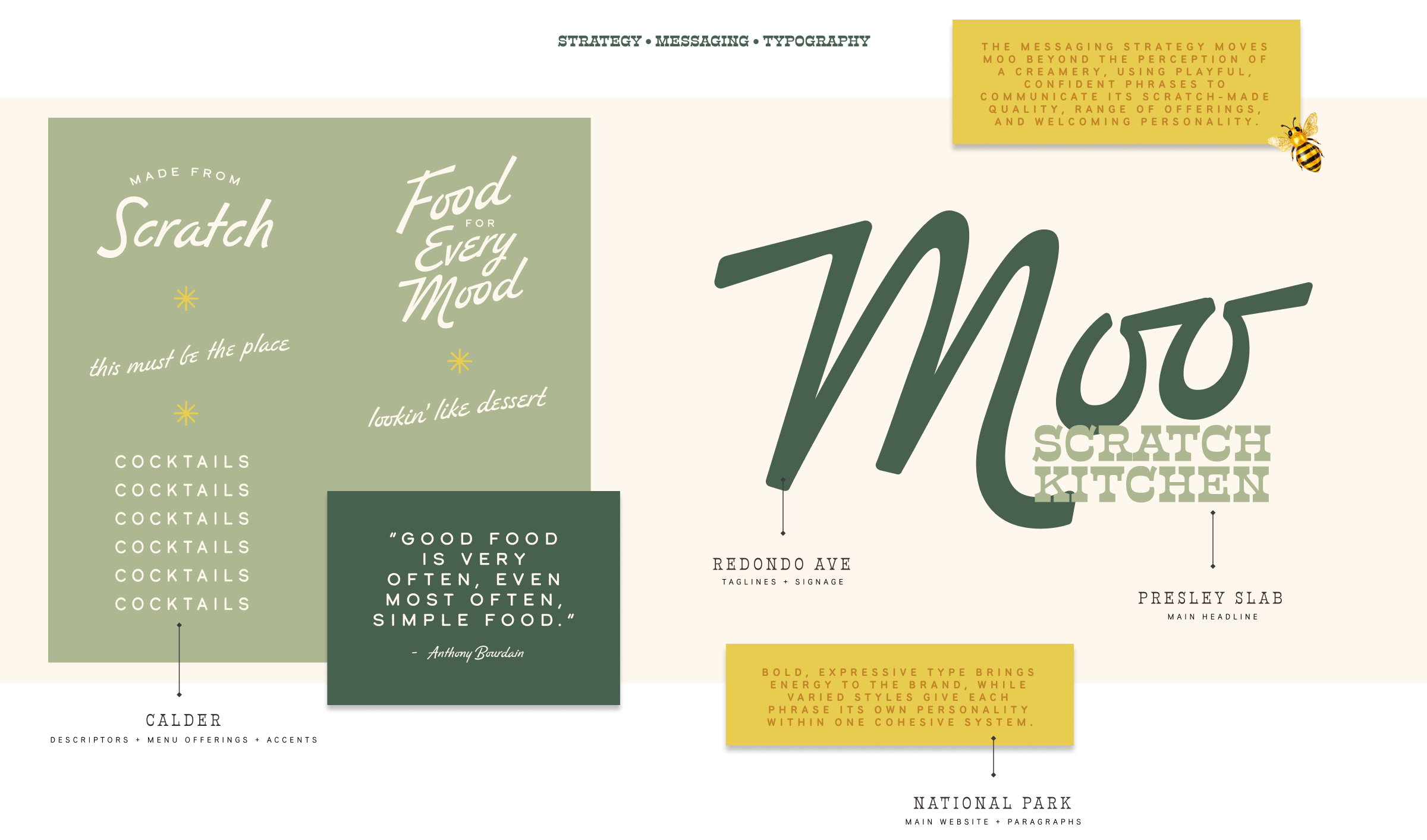
The voice we developed was warm, familiar, clear, confident, and creatively playful. Moo could make a clever food pun or add a little sass, but it always needed to sound grounded in genuine skill and experience. We avoided language that felt corporate, overly polished, trend-chasing, or so nostalgic that the brand appeared stuck in the past.
One of the most important strategic realizations was that Moo did not need to abandon its history to reach a broader audience. Its legacy was an advantage, but only when presented as a living foundation rather than the entire story. The audience expanded to include downtown professionals, young design-conscious social explorers, business customers, catering clients, and newcomers, while longtime families and regulars remained essential. The work was not about replacing one target market with another. It was about creating a brand flexible enough to welcome all of them.
Brand Identity
The goal was to build on Moo’s recognizable identity, expanding it into a flexible visual system that could bring consistency and personality to every part of the brand, from the restaurant and bakery to packaging, signage, digital platforms, and social media.
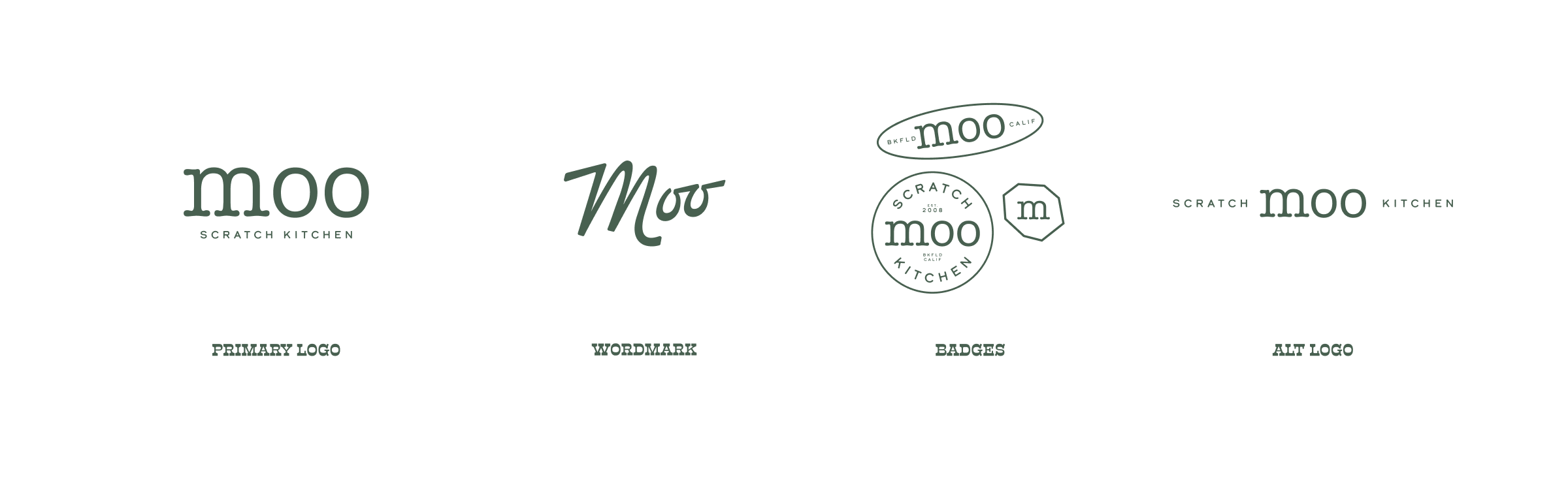
We retained the familiarity and personality associated with the Moo name while introducing a stronger visual hierarchy and a modular logo family. The primary stacked logo became the central brand anchor, while supporting lockups and badges allowed the identity to adapt to different formats and offerings without losing cohesion.
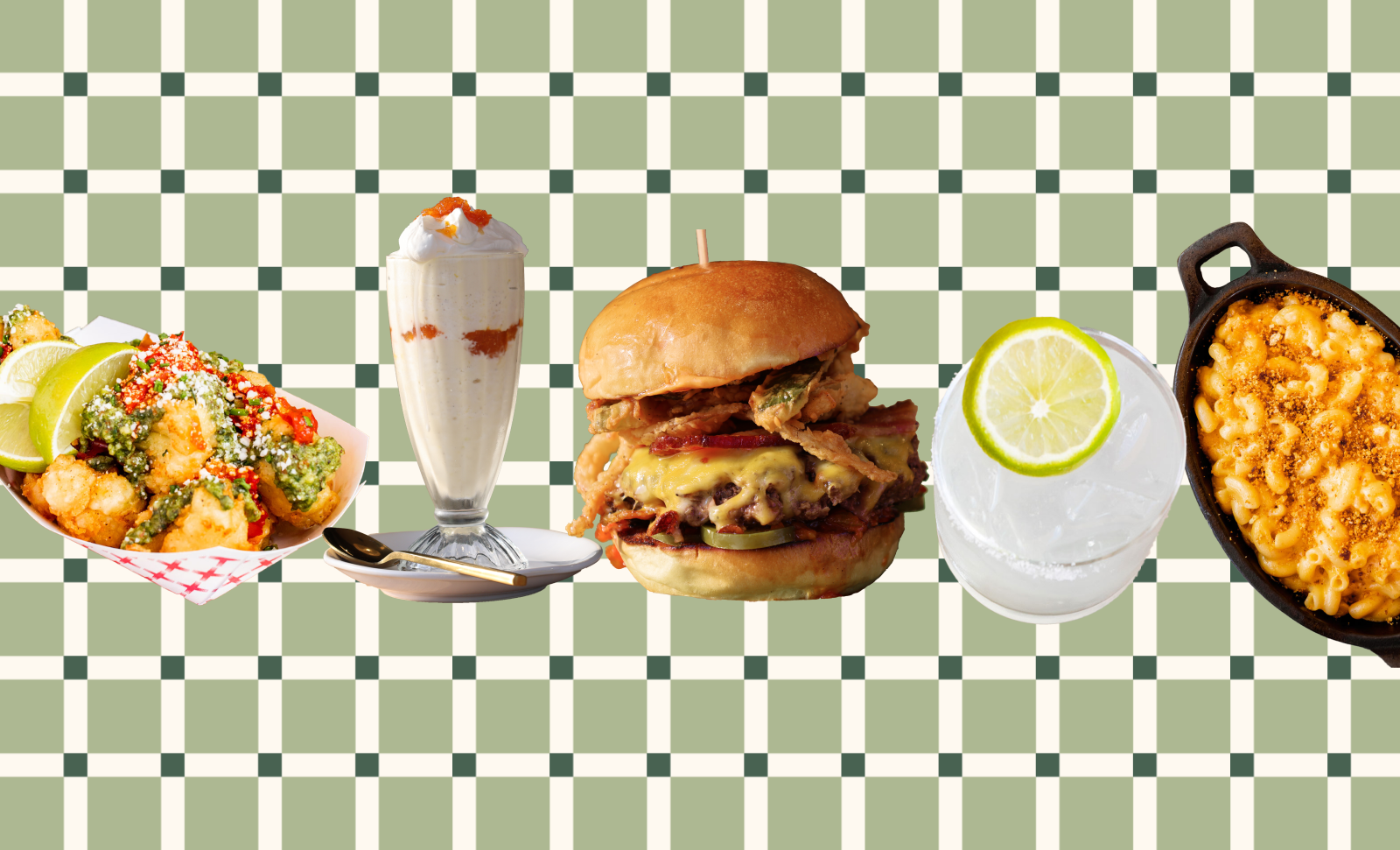
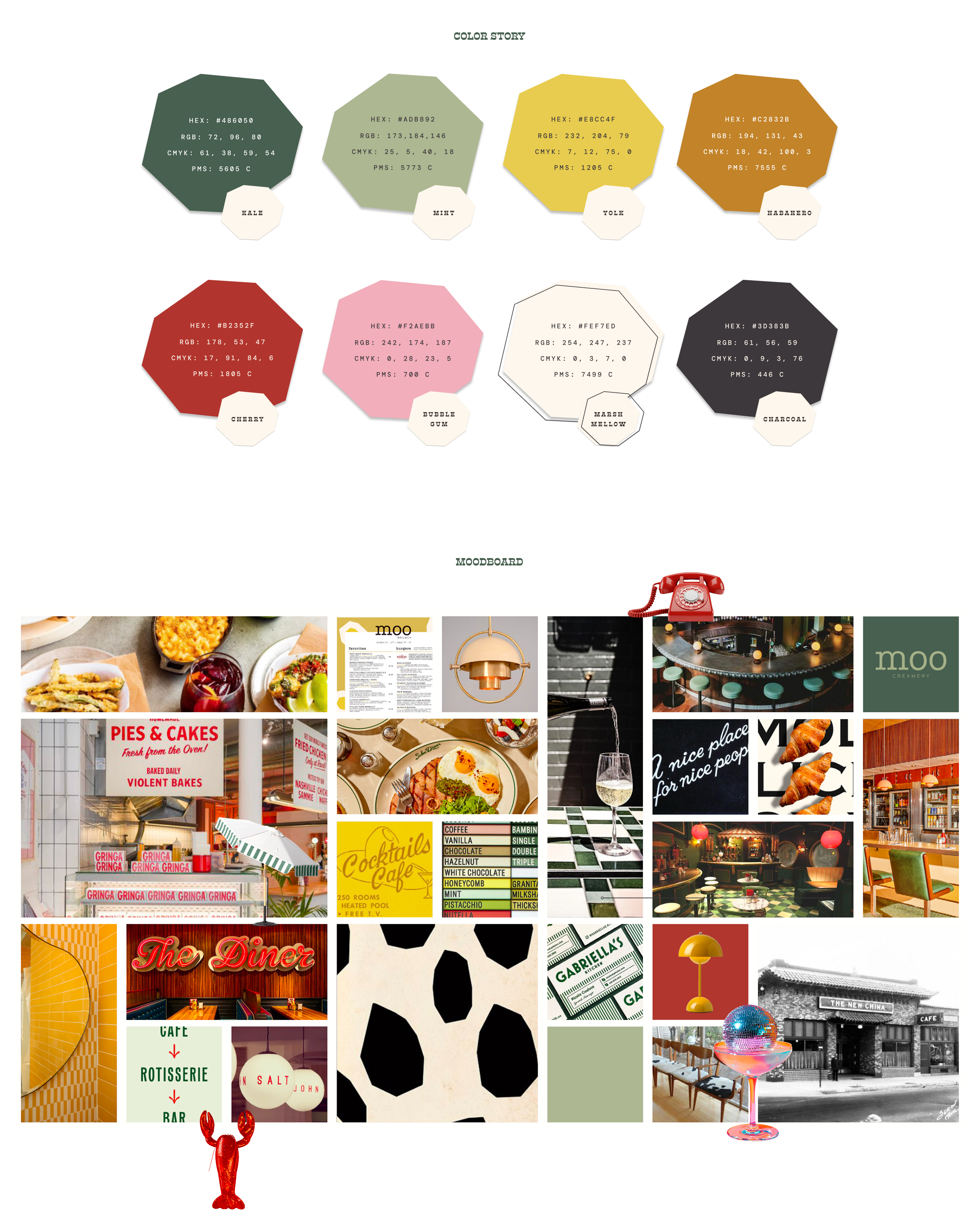
The updated visual direction blended classic American diner references with Bakersfield character and a more expressive, retro-maximalist sensibility. Rather than creating a nostalgic theme restaurant, we used familiar cues in a fresh way: confident typography, energetic compositions, warm food photography, bold color combinations, illustrations, and playful patterns.
The expanded palette brought together cherry red, yolk yellow, habanero orange, bubblegum pink, mint, kale green, charcoal, espresso, and marshmallow. This gave the brand enough range to feel lively and whimsical while still allowing individual applications to remain clear and intentional.
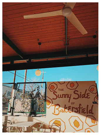
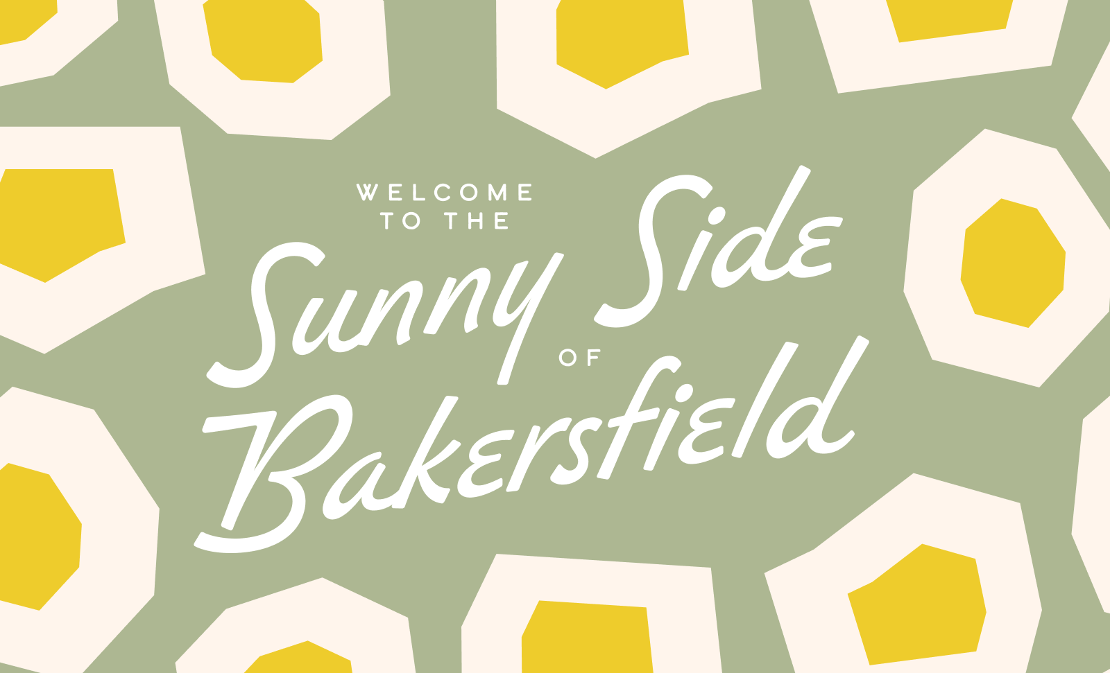
Patterns and illustrations helped connect Moo’s history to its downtown environment. Cow spots were reinterpreted as sunny-side-up eggs, tile-inspired patterns referenced the façade of the new building, and irregular cow-print graphics nodded to the original Moo identity without relying on predictable dairy clichés.
Previously, Moo’s service offerings were not always clearly differentiated, which contributed to the perception that the brand was primarily a creamery. Our system gave each offering, including the restaurant, bakery, creamery, and catering, its own distinct presence while maintaining a clear connection to the master brand. The result is a cohesive visual language that organizes Moo’s full range of services without making them feel like separate, unrelated businesses.
The greatest challenge was balancing abundance with usability. The brand needed to feel quirky but clear, playful but not childish, and vibrant without becoming visually overwhelming.
Brand Experience + Collateral
Our work extended far beyond the traditional boundaries of graphic design. We helped shape how the brand would be experienced throughout the new downtown location, approaching the restaurant with the same level of intention as an interior and environmental design project.
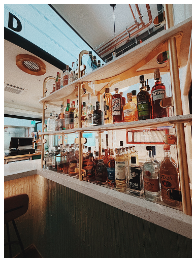
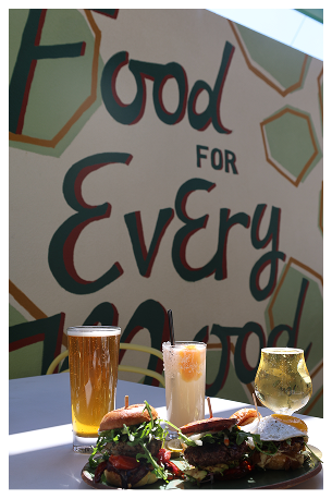
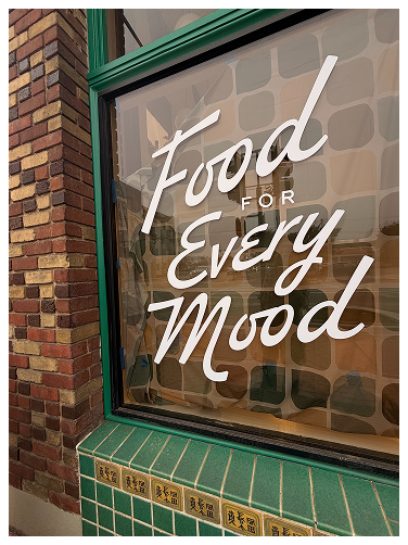
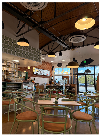
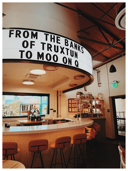
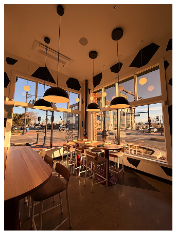
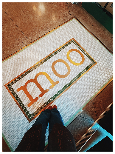
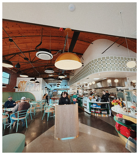
From the front entry signage and exterior details to dining-room features, decals, wall art, and interior accents, each element was designed to make the physical space feel unmistakably Moo. These elements cross through the front entry, east and west dining rooms, and patio, showing how deeply the visual identity was integrated into the environment.
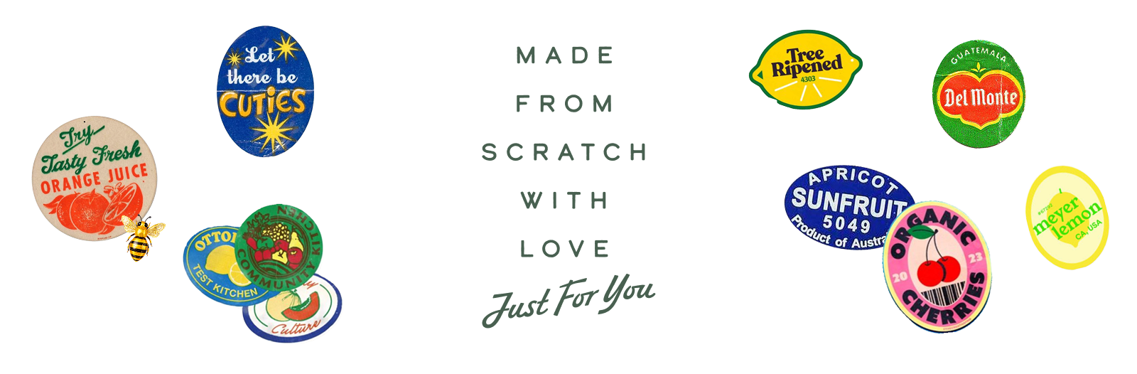
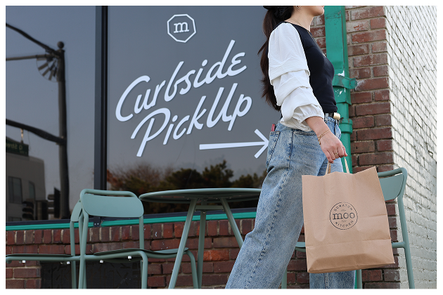
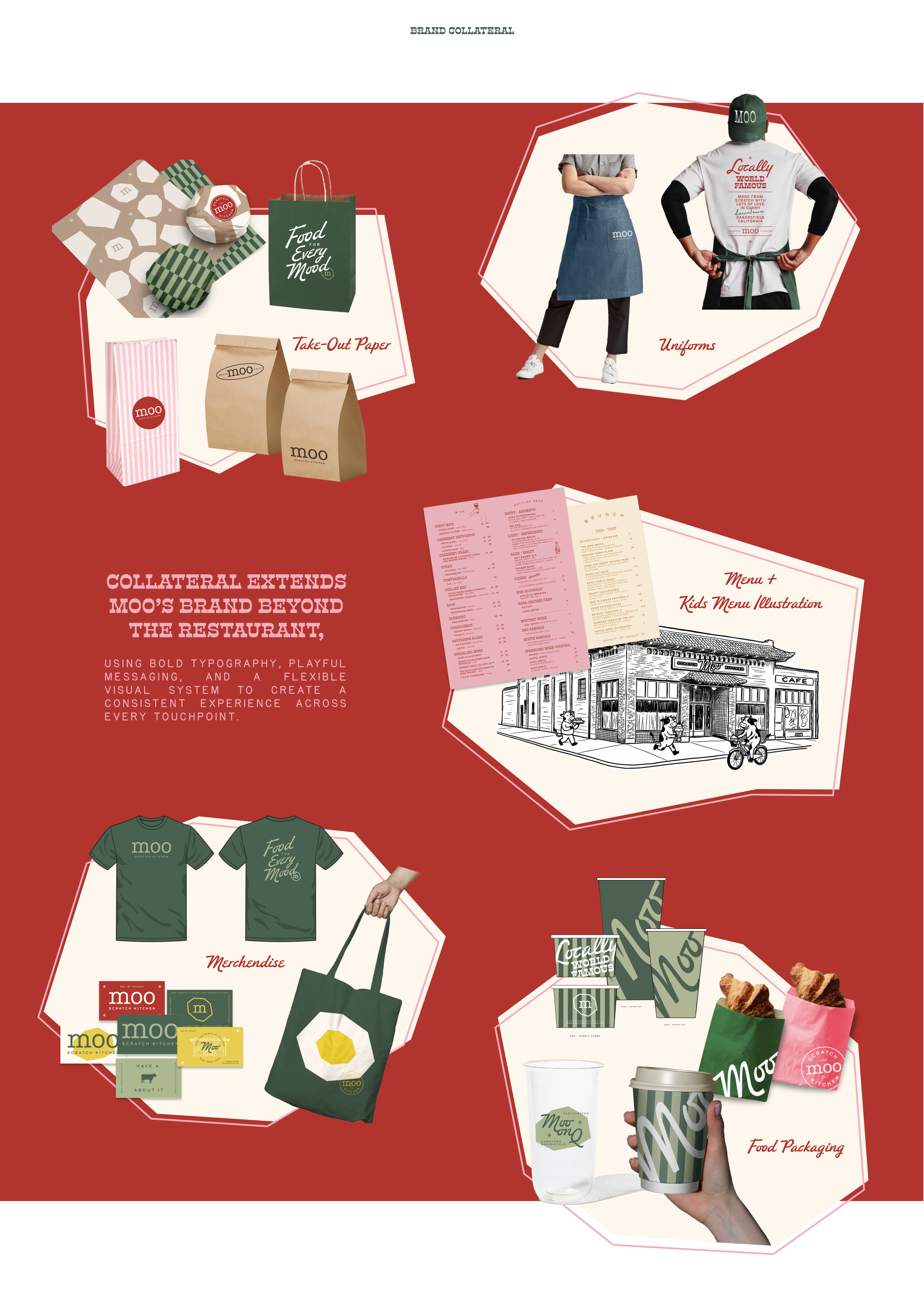
That same thinking carried into the smallest guest touchpoints. We designed packaging stickers and seals, food paper, bakery and catering bags, ice cream containers, coffee and paper cups, coasters, uniforms, and merchandise. Rather than treating these as separate pieces, we built a coordinated family of materials that carried Moo’s branding through every part of the customer experience.
Every detail was customized for how and where it would be used. Signage created recognition and a sense of arrival. Murals and interior features brought energy and storytelling into the dining room. Packaging extended the experience beyond the restaurant, while uniforms and merchandise gave the team and community new ways to carry the brand. Together, these pieces transformed the identity from a visual system into a complete, lived-in environment.
The result was a cohesive brand experience that felt thoughtful at every scale.
Website Design
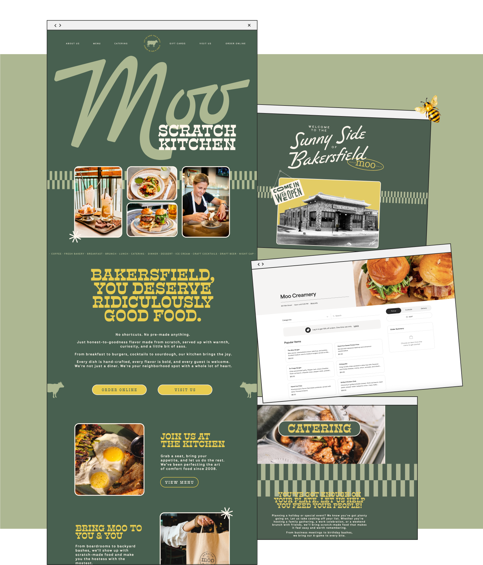
The website became the clearest digital expression of Moo’s next chapter. Rather than reinventing the brand for the sake of change, we translated its updated strategy, messaging, and visual system into an experience that feels more useful, immersive, and unmistakably Moo.
A key priority was showing the full range of what Moo does from the start. Coffee, bakery, breakfast, brunch, lunch, catering, dinner, dessert, ice cream, cocktails, and nightcaps now live together as one cohesive experience, moving the brand beyond the perception that it is primarily a creamery.
We also made the path to what guests need most more direct, from viewing the menu and ordering online to exploring catering, purchasing gift cards, and finding the downtown location. At the same time, the site gives Moo’s story more room to breathe, framing the move as a natural next step and highlighting the history, local relationships, ownership, and hospitality behind the brand.
Oversized type, rich color, bold patterns, food photography, and playful copy bring the energy of the restaurant online, giving visitors a taste of Moo before they ever walk through the door.
Impact
Our work gave Moo a unified foundation for one of the most significant transitions in its history.
What began as a location move became a broader clarification of the brand: Moo was no longer being presented as a creamery that also served food, but as a full scratch kitchen with a beloved creamery legacy.
The updated strategy allowed Moo to communicate its range more clearly, connect with new downtown audiences, and preserve the loyalty of longtime guests. The visual identity brought cohesion across the restaurant interior, exterior signage, menus, uniforms, murals, packaging, merchandise, social media, and website making every part of the experience feel unmistakably Moo.
The website became a functional introduction to the refreshed identity and downtown location, while social media served as an ongoing storytelling platform before, during, and after launch. Together, these touchpoints helped guide guests through the transition, build excitement, and make the new space feel both fresh and familiar.
Most importantly, the work gave Moo a system that could grow. The brand now has the structure to introduce new menu programs, bakery products, catering services, collaborations, merchandise, and future concepts without losing the personality and community connection that made it meaningful in the first place.
The result is a brand that feels like Moo always should have felt: deeply local, unapologetically expressive, genuinely welcoming, and full of ridiculously good food.